Card
Angular Material Card is a flexible container for displaying content in a structured and contextual manner. A card can carry a header with a title, a subtitle and an avatar, a full width image, a block of text, a row of actions and a footer, and it comes in a raised, an outlined and a filled appearance. BuilderKit restyles the surface, the border and the spacing between those parts.
The row at the bottom of a card is usually built from button components, which keeps its actions in line with the rest of the page.
Example
Below is an example of how BuilderKit restyles the Angular Material Card and gives it a more modern appearance.
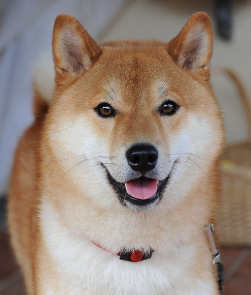

The Shiba Inu is the smallest of the six original and distinct spitz breeds of dog from Japan. A small, agile dog that copes very well with mountainous terrain, the Shiba Inu was originally bred for hunting.
The Chihuahua is a Mexican breed of toy dog. It is named for the Mexican state of Chihuahua and is among the smallest of all dog breeds. It is usually kept as a companion animal or for showing.
<mat-card>
  <mat-card-header>
    <img matCardAvatar src="shiba1.jpg" />
    <mat-card-title>Shiba Inu</mat-card-title>
    <mat-card-subtitle>Dog Breed</mat-card-subtitle>
  </mat-card-header>
  <img matCardImage src="shiba2.jpg" />
  <mat-card-content>
    <p>
      The Shiba Inu is the smallest of the six original and distinct
      spitz breeds of dog from Japan. A small, agile dog that copes
      very well with mountainous terrain, the Shiba Inu was originally
      bred for hunting.
    </p>
  </mat-card-content>
  <mat-card-actions>
    <button matButton>LIKE</button>
    <button matButton>SHARE</button>
  </mat-card-actions>
</mat-card>
Appearances
The appearance attribute accepts outlined, raised (the default), and filled. BuilderKit styles outlined and raised the same way, so the examples above cover both.
The filled appearance is the distinct one. The card turns into a soft filled surface and mat-card-content becomes a nested well with its own background and border. Headers, images, and actions stay on the filled surface, which makes it a good fit for settings panels and dashboard tiles.
<mat-card appearance="filled">
  <mat-card-content>Filled card</mat-card-content>
</mat-card>

<mat-card appearance="filled">
  <mat-card-header>
    <mat-card-title>Notifications</mat-card-title>
    <mat-card-subtitle>Choose how you want to be notified</mat-card-subtitle>
  </mat-card-header>
  <mat-card-content>
    <div class="flex flex-col gap-y-4">
      <mat-slide-toggle labelPosition="before" fullwidth checked>Email</mat-slide-toggle>
      <mat-slide-toggle labelPosition="before" fullwidth>Push notifications</mat-slide-toggle>
      <mat-slide-toggle labelPosition="before" fullwidth>Weekly digest</mat-slide-toggle>
    </div>
  </mat-card-content>
  <mat-card-actions align="end">
    <button matButton class="small">Reset</button>
    <button matButton class="primary small">Save</button>
  </mat-card-actions>
</mat-card>
Cards in a grid
Cards of the same width line up side by side in a grid and fall back into a single column once the screen gets narrow.
Everything you need to ship your first app.
Shared projects, roles and a longer history.
<div class="grid grid-cols-1 gap-6 sm:grid-cols-2">
  <mat-card>
    <mat-card-header>
      <mat-card-title>Starter</mat-card-title>
      <mat-card-subtitle>For a single project</mat-card-subtitle>
    </mat-card-header>
    <mat-card-content>
      <p>Everything you need to ship your first app.</p>
    </mat-card-content>
    <mat-card-actions>
      <button matButton class="small">Choose</button>
    </mat-card-actions>
  </mat-card>

  <mat-card>
    <mat-card-header>
      <mat-card-title>Team</mat-card-title>
      <mat-card-subtitle>For up to ten people</mat-card-subtitle>
    </mat-card-header>
    <mat-card-content>
      <p>Shared projects, roles and a longer history.</p>
    </mat-card-content>
    <mat-card-actions>
      <button matButton class="primary small">Choose</button>
    </mat-card-actions>
  </mat-card>
</div>