Built for composition, not configuration
Most Angular UI libraries rely on large components with dozens of inputs. You configure behavior through properties, but have limited control over structure.
BuilderKit takes a different approach. These components are built using composable directives, allowing you to structure UI exactly how you need. Instead of forcing everything through inputs, you control layout, behavior, and content directly in the template.
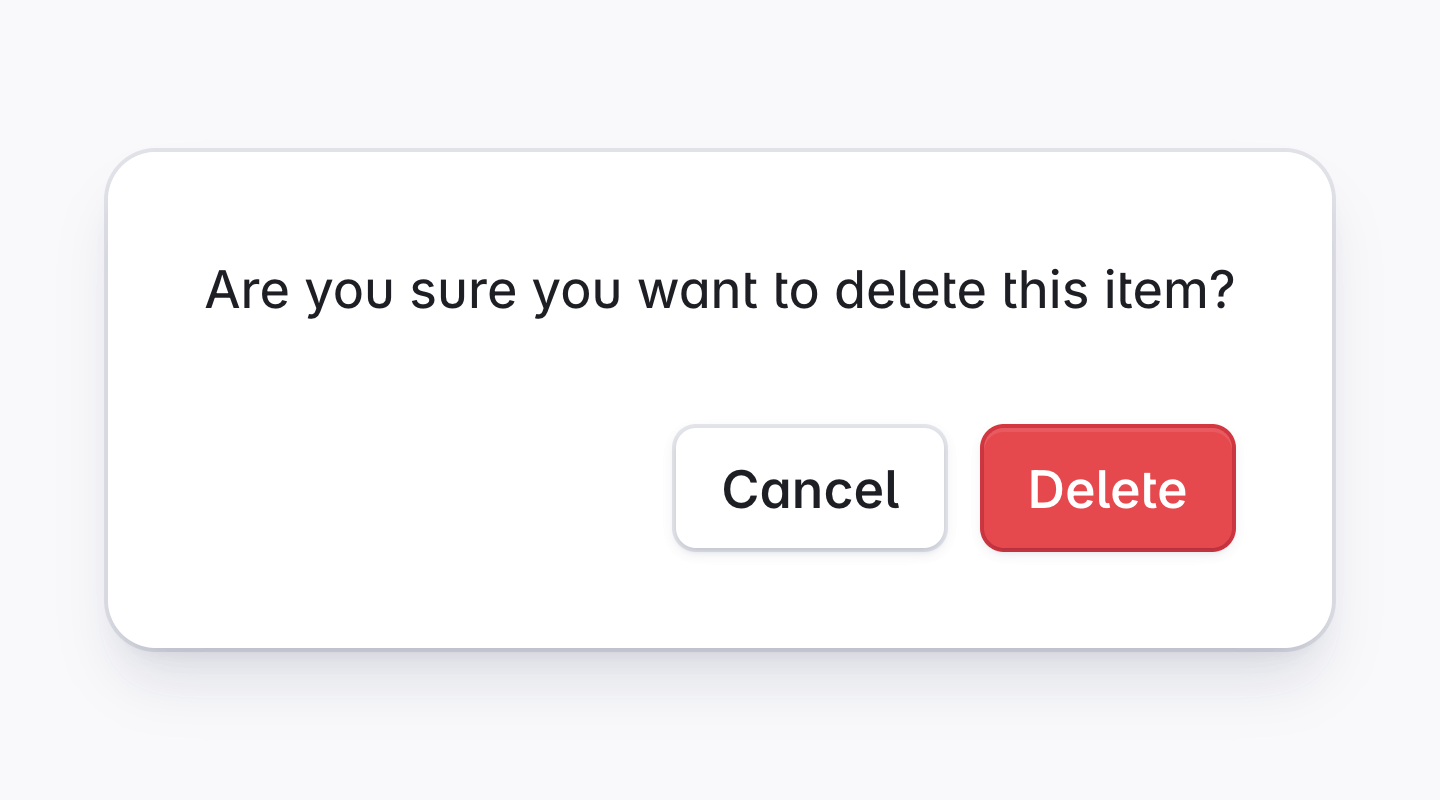
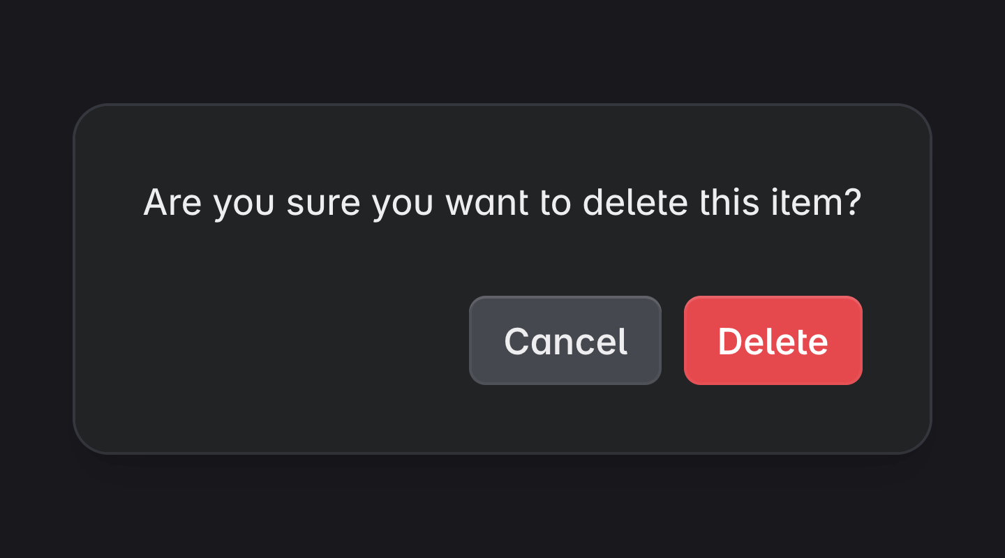
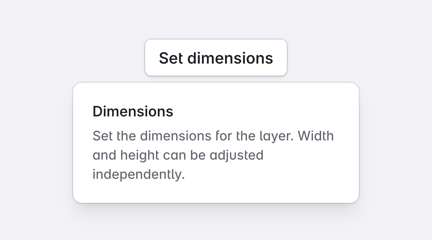
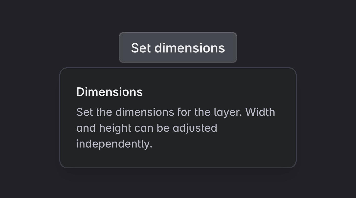
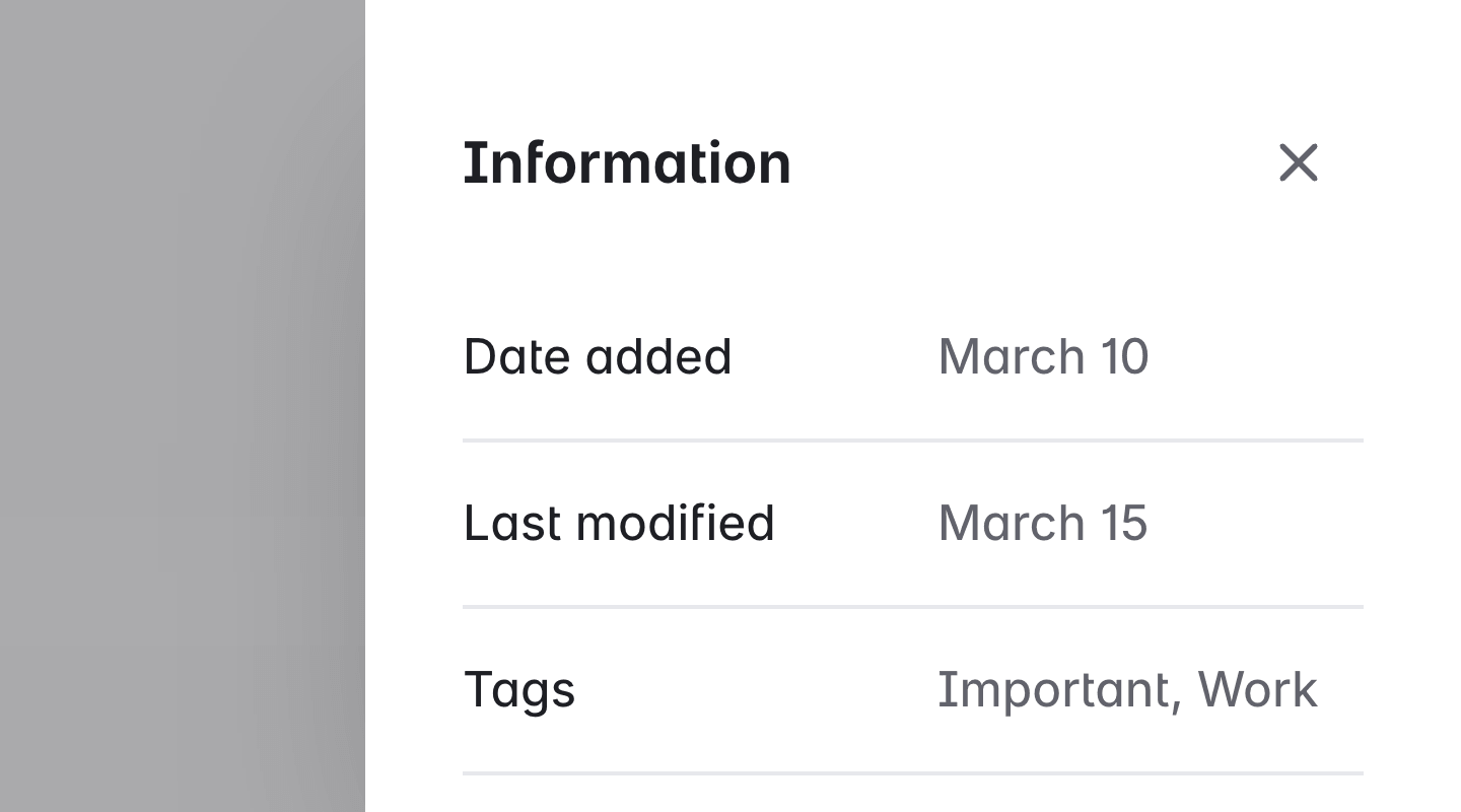
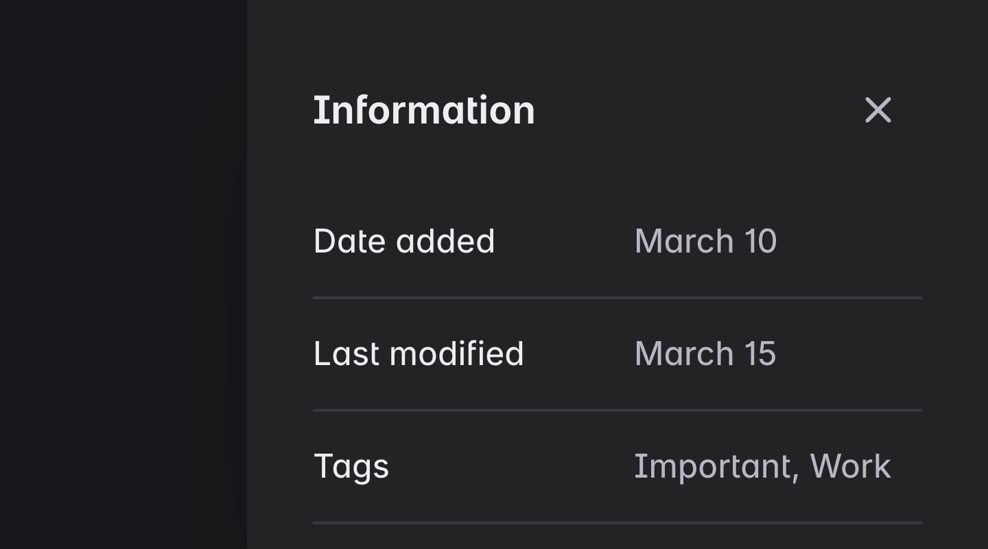
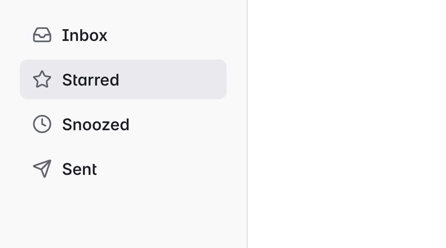
This makes it easier to build real interfaces like sidebars, nested navigation, dialogs, and popovers without fighting the component.
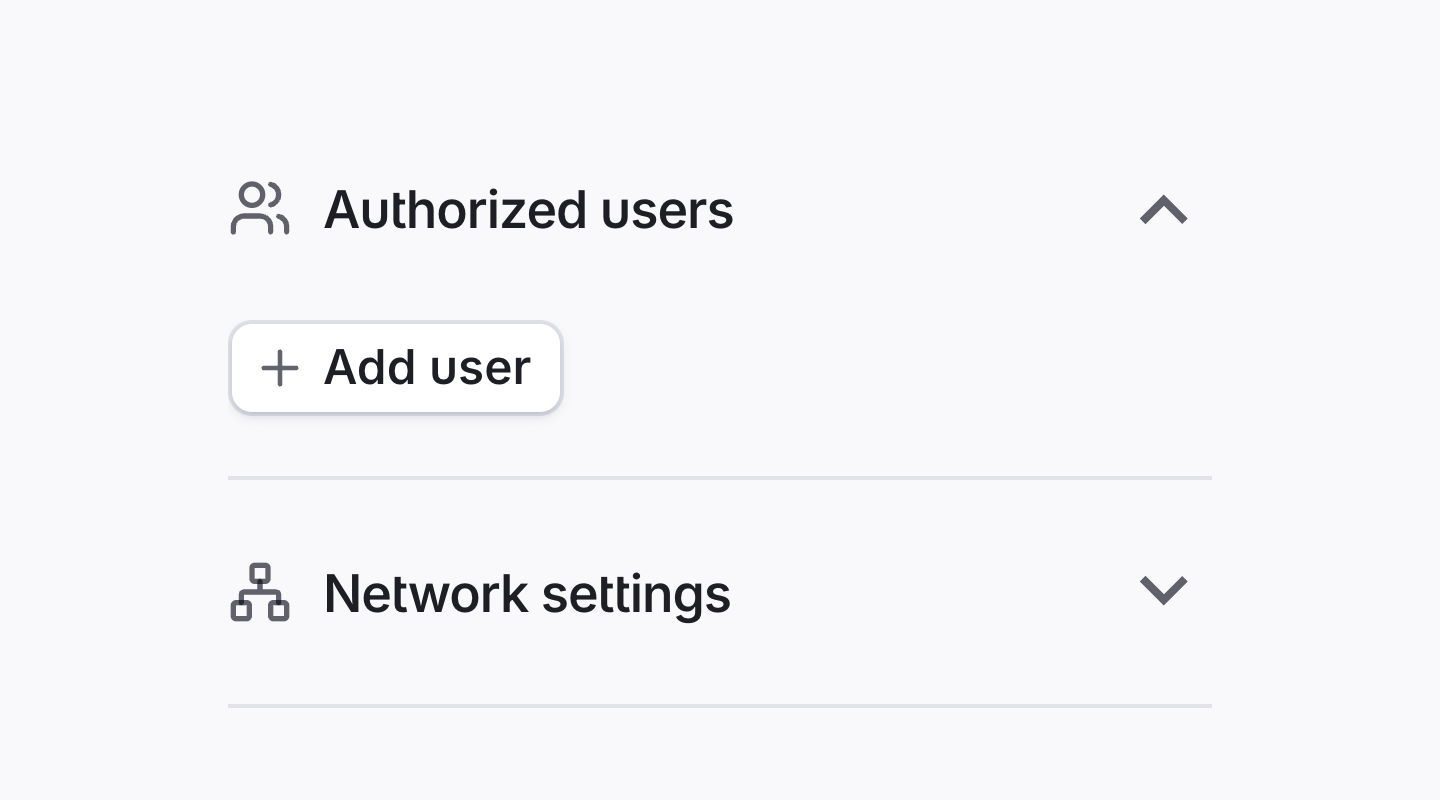
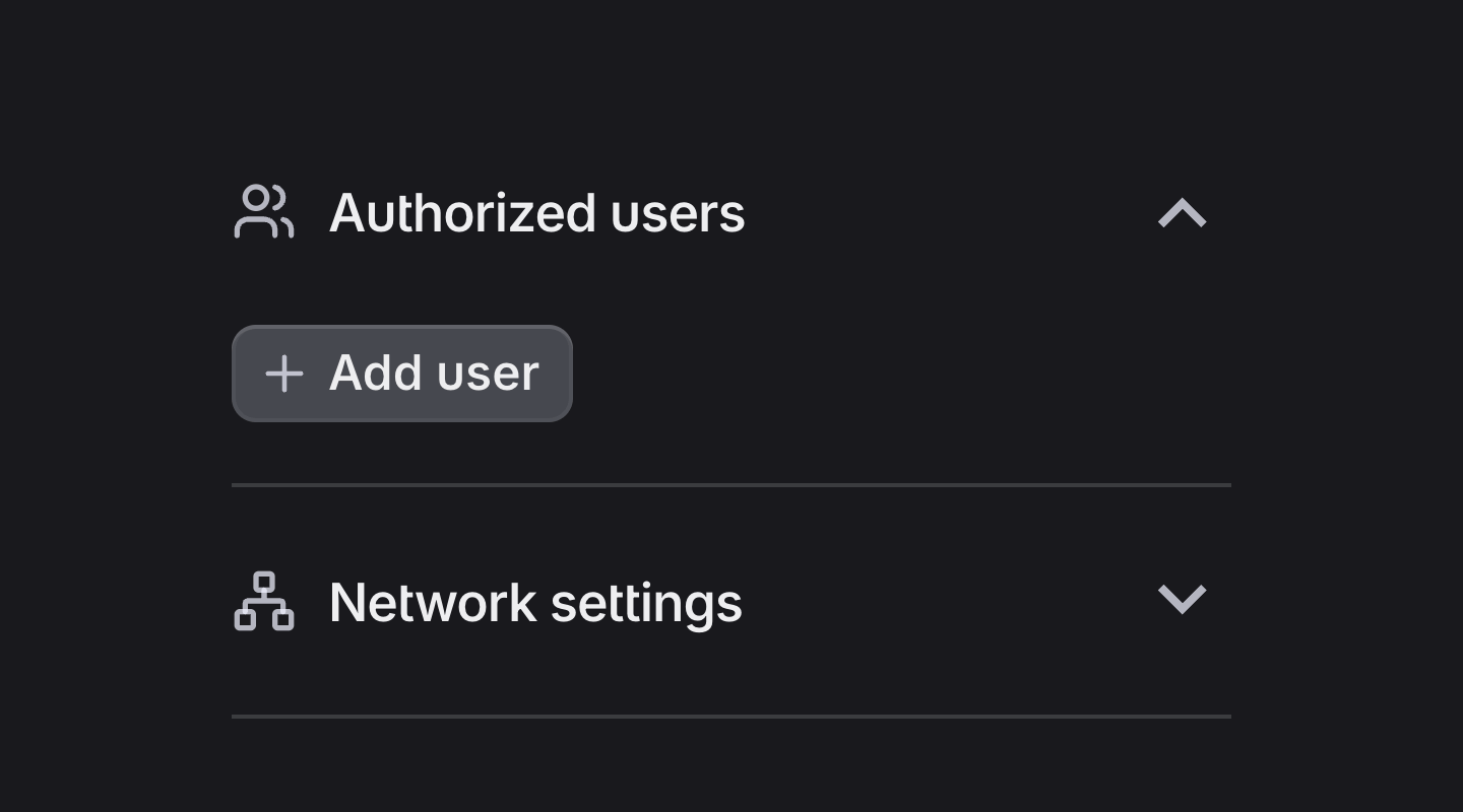
Components for real UI patterns like dialogs, popovers, sidebars, and collapsible layouts.
Explore the full range of advanced components BuilderKit provides you to build beautiful Angular applications, faster.