
Angular Material, Rebuilt for Modern UI
Stable APIs, built-in accessibility, battle-tested components. BuilderKit keeps the foundation and replaces the design.
😩
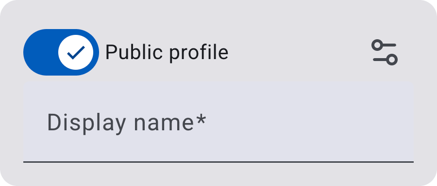
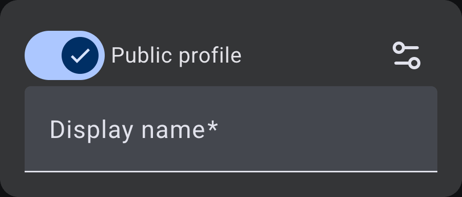
BEFORE
🤩
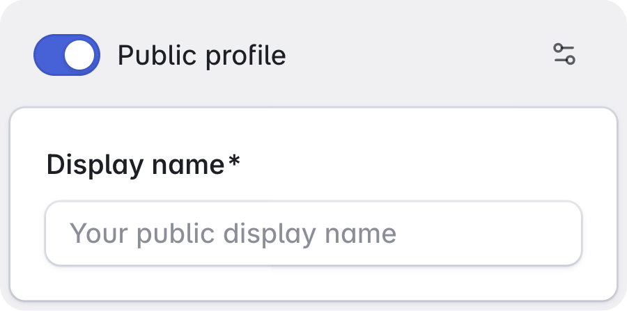
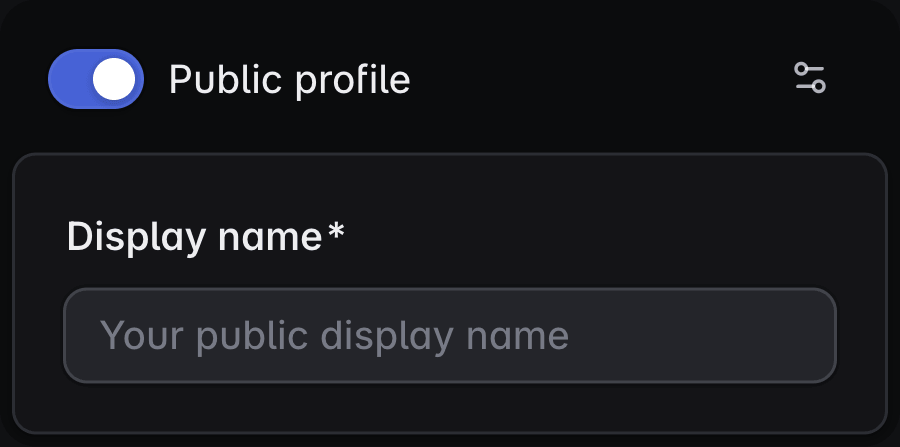
AFTER
The Material look, gone
Angular Material stays as the foundation. BuilderKit removes the default design and rebuilds it in plain CSS, so the same form field ships with a modern look.
See it in the docs<mat-card appearance="filled">
<mat-card-header>
<div class="flex flex-auto items-center gap-x-2">
<mat-icon class="size-4" svgIcon="globe" />
Public profile
<div class="flex-auto"></div>
<mat-slide-toggle checked></mat-slide-toggle>
</div>
</mat-card-header>
<mat-card-content>
<mat-form-field class="w-full">
<mat-label>Display name</mat-label>
<input matInput required placeholder="Your public display name"/>
</mat-form-field>
</mat-card-content>
</mat-card>Keep the APIs
The same components, the same inputs, the same behavior. Nothing to migrate, and your coding agent already knows Angular Material.
Read the documentationEvery component, rebuilt
All the Angular Material components you already use, restyled into a clean, modern design system and ready to drop into your application.
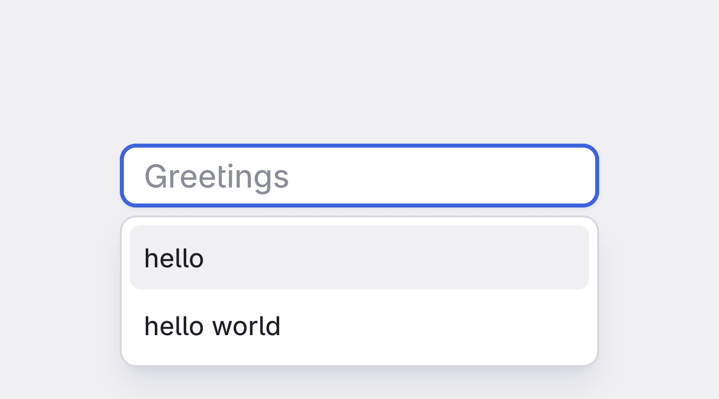
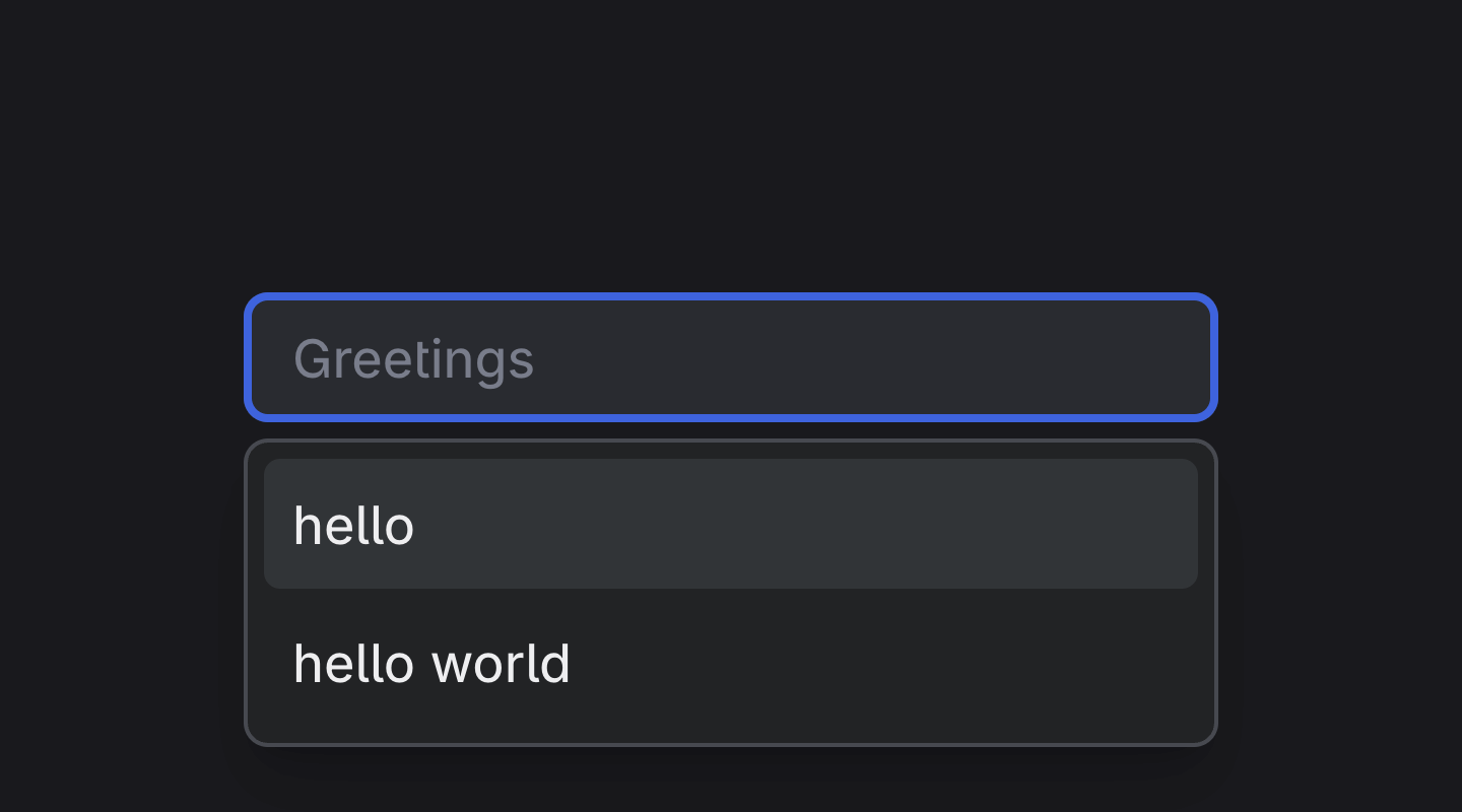
Autocomplete
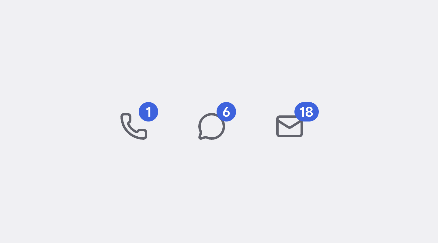
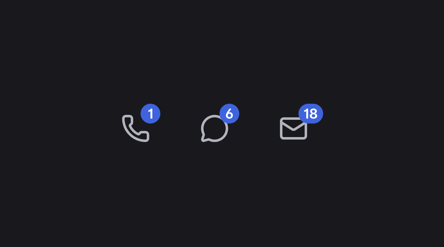
Badge
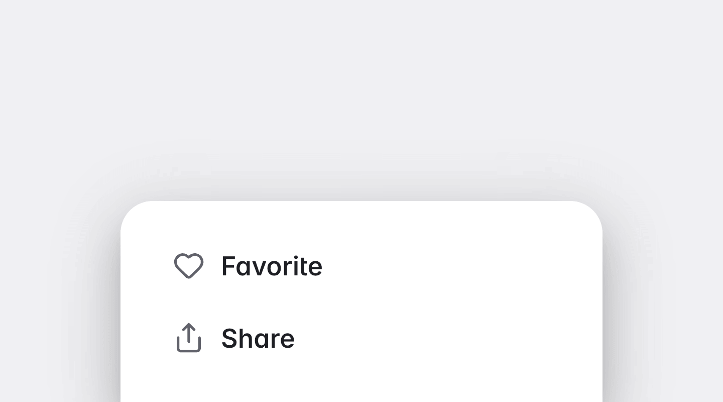
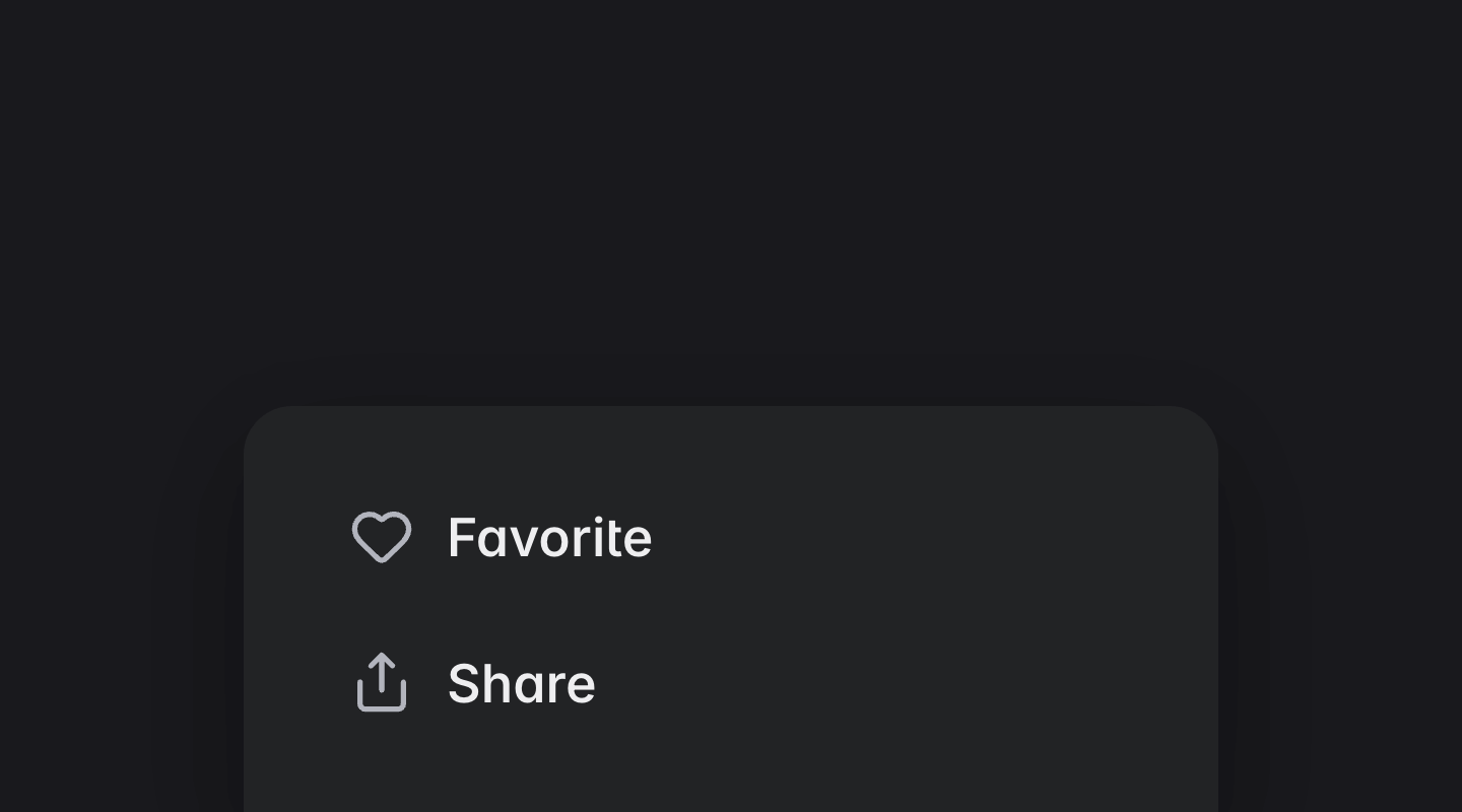
Bottom Sheet
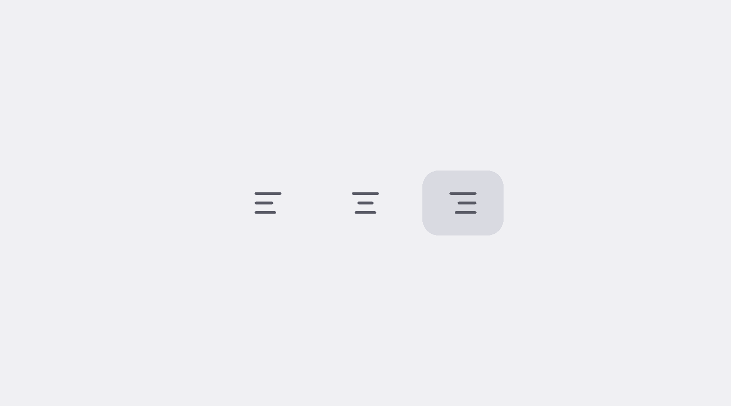
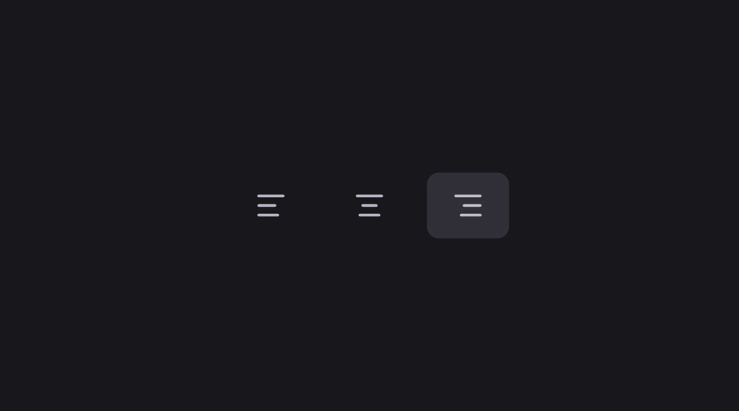
Button Toggle
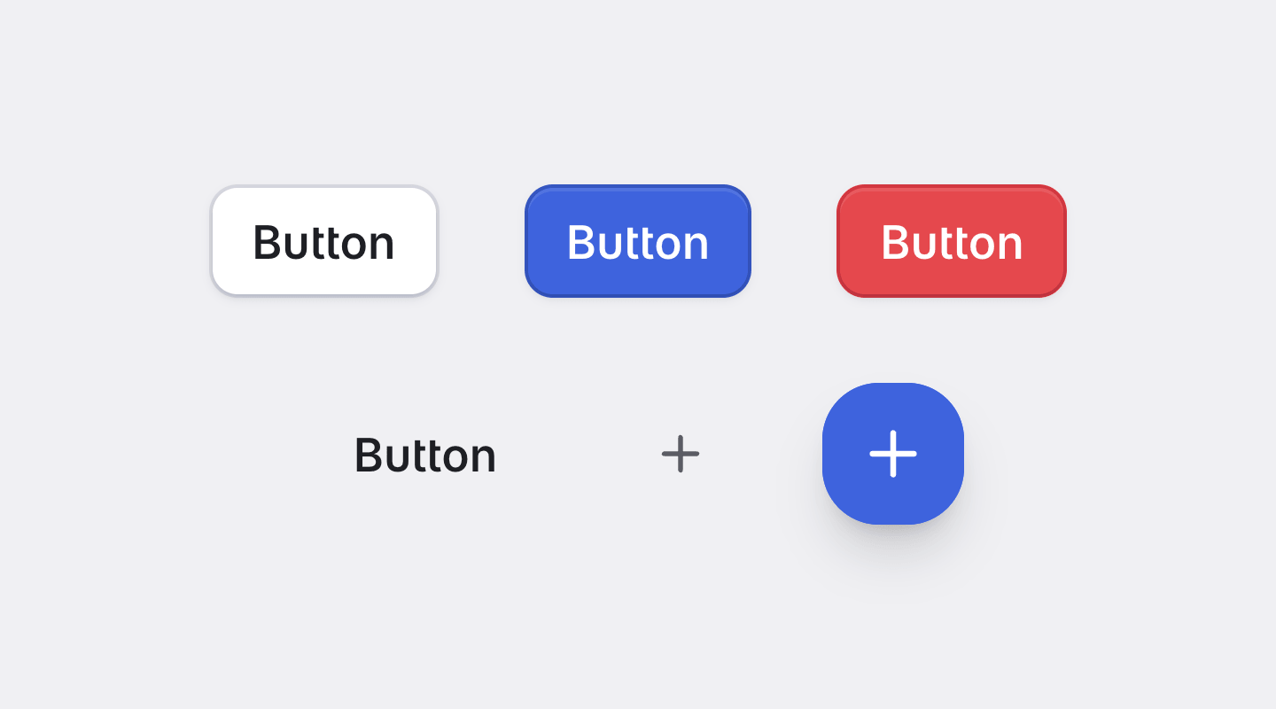
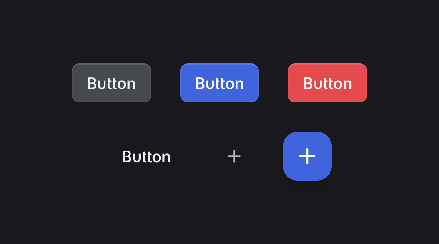
Button
Card
Checkbox
Chips
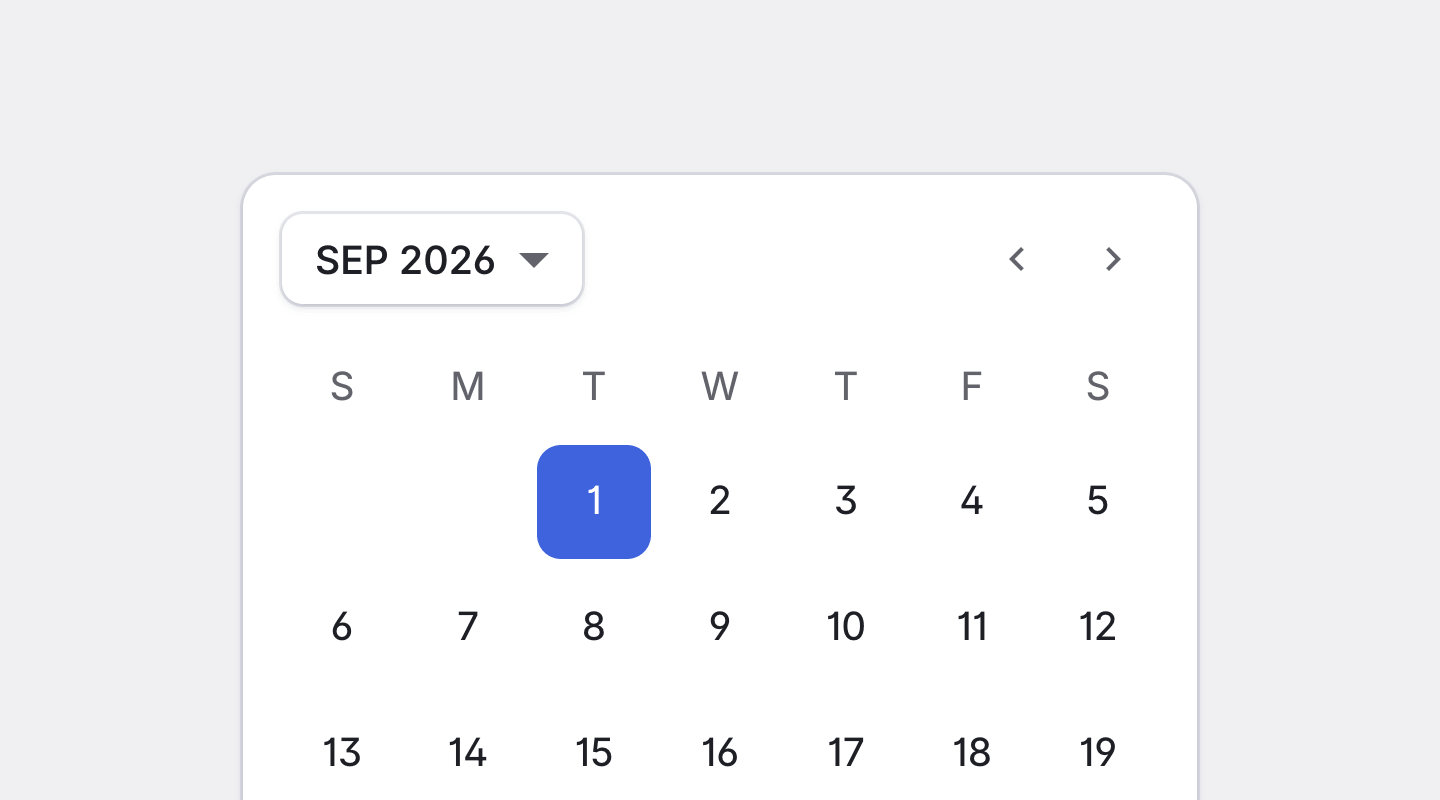
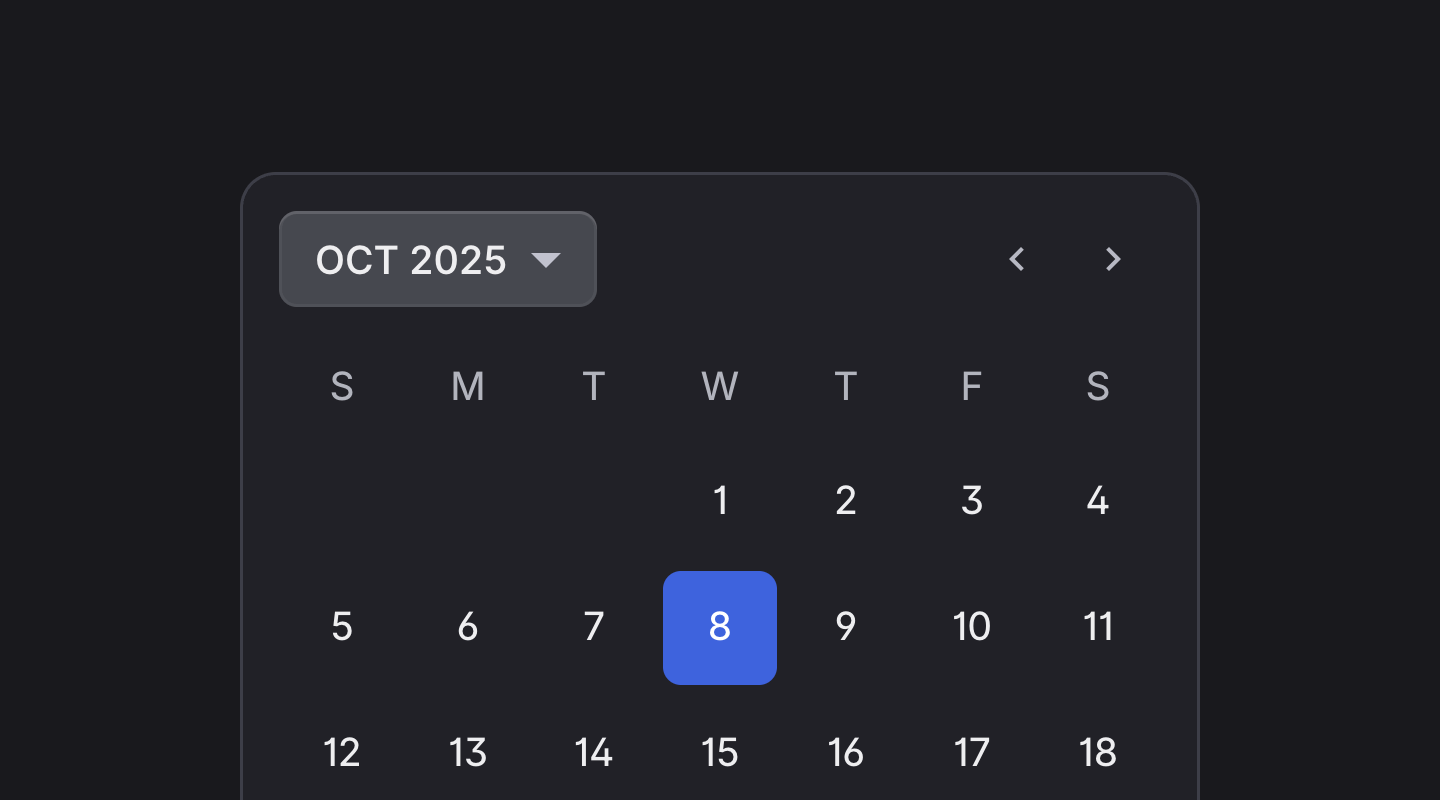
Datepicker
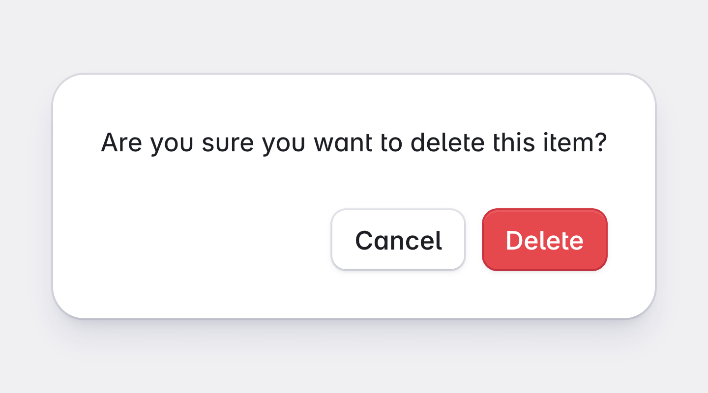
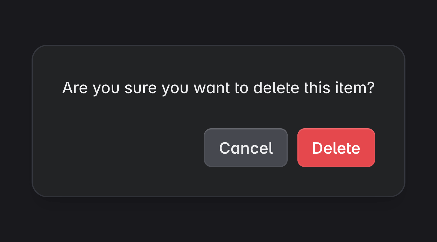
Dialog
Divider
Expansion Panel
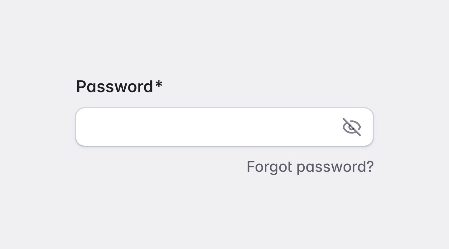
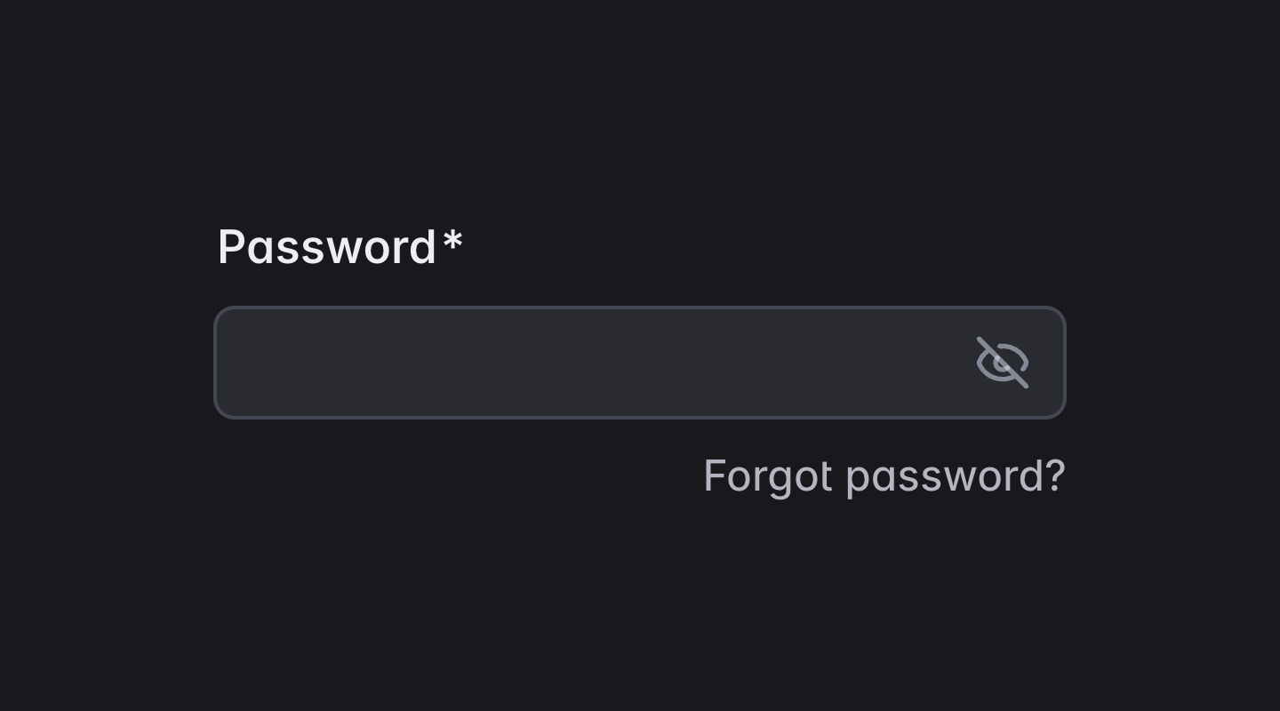
Form Field
Grid List
Icon
List
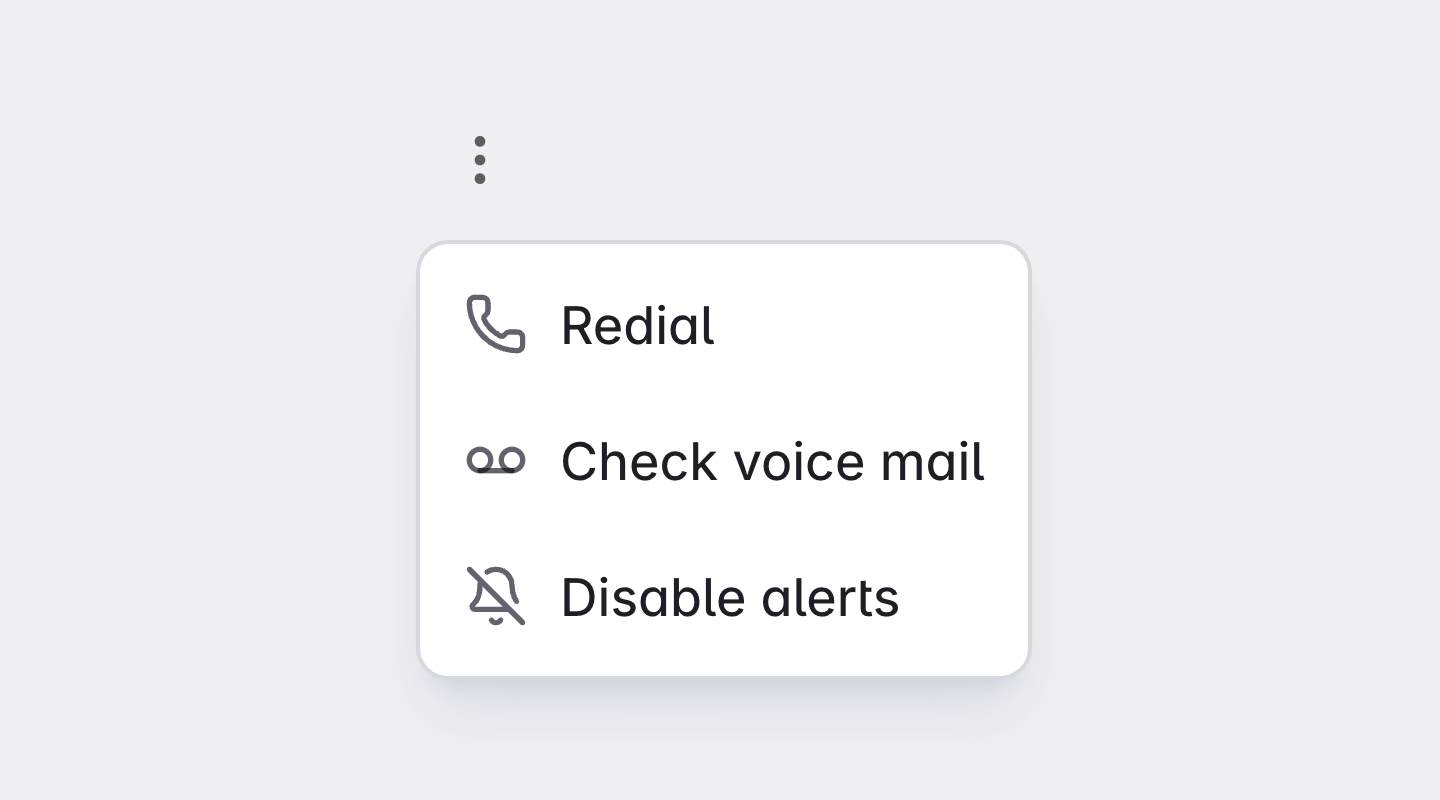
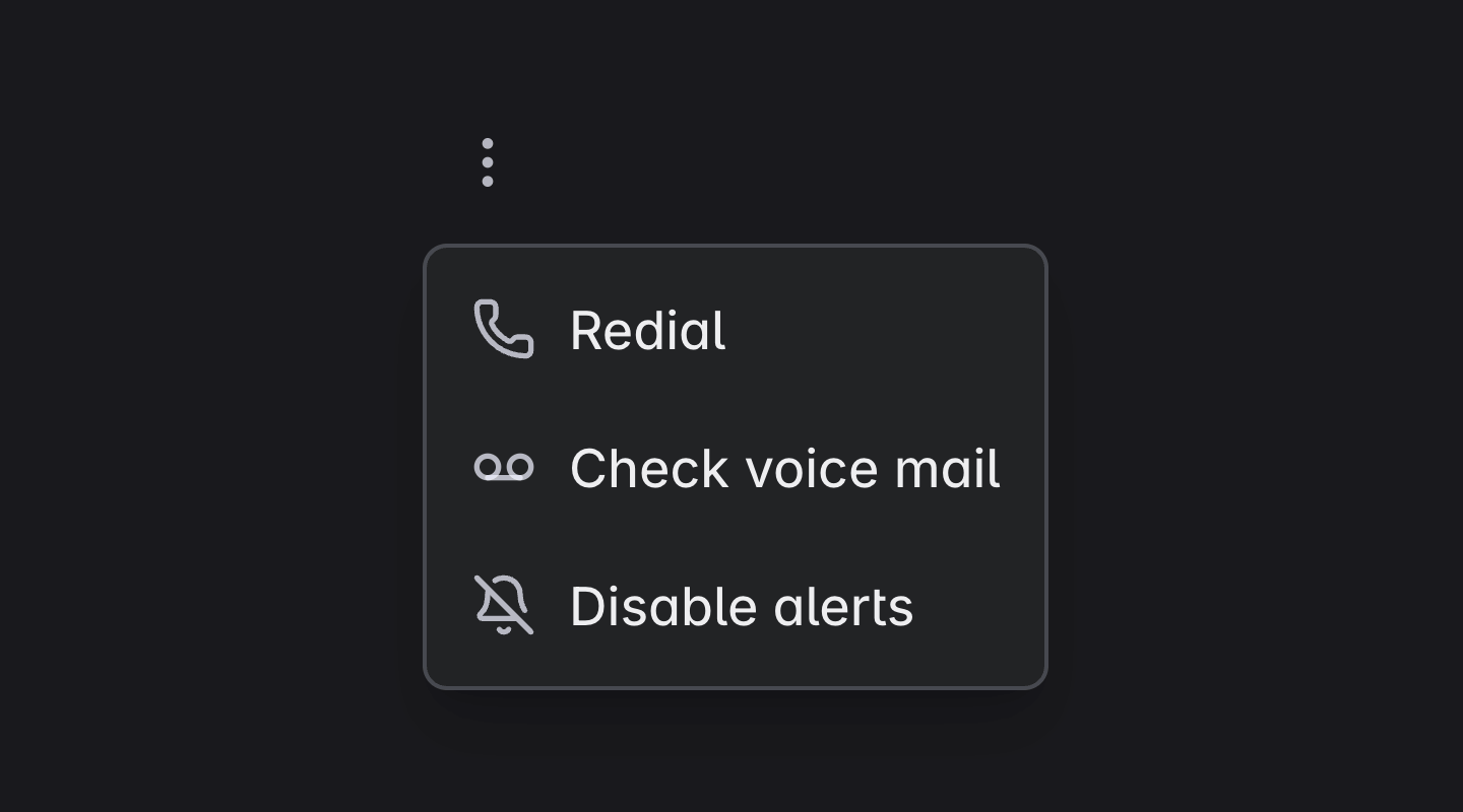
Menu
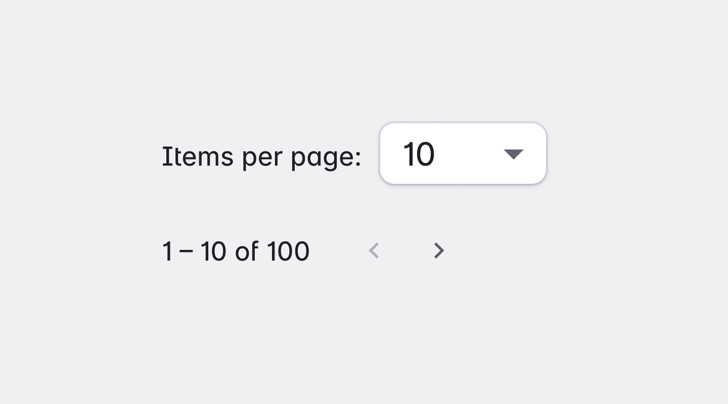
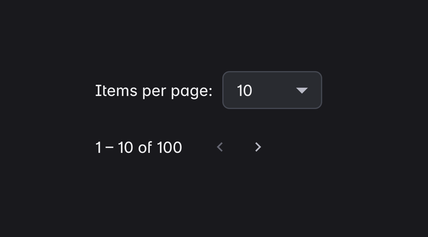
Paginator
Progress Bar
Progress Spinner
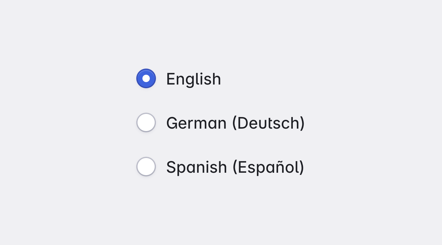
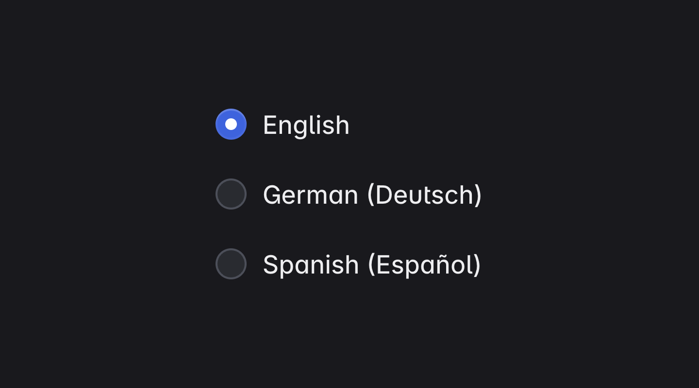
Radio Button
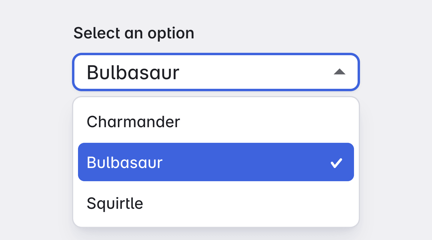
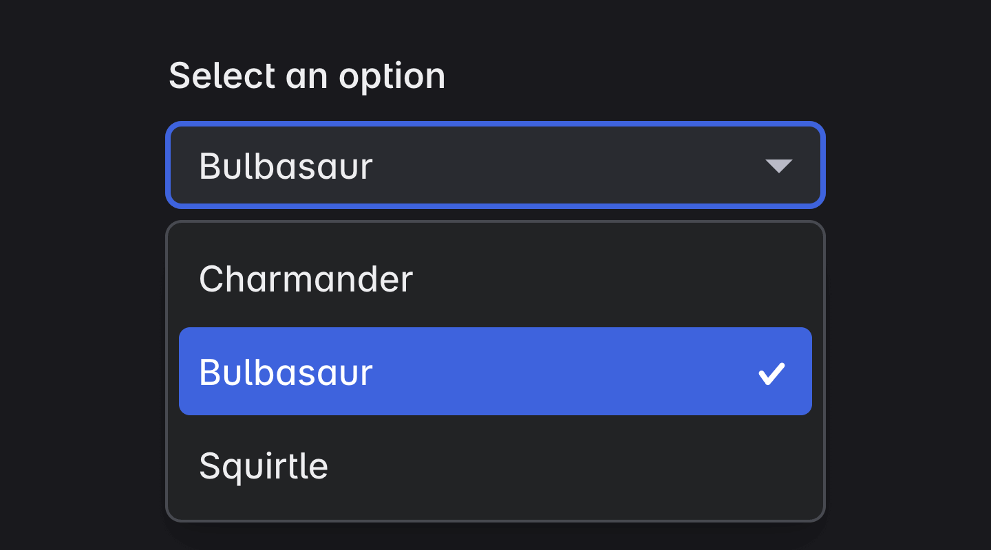
Select
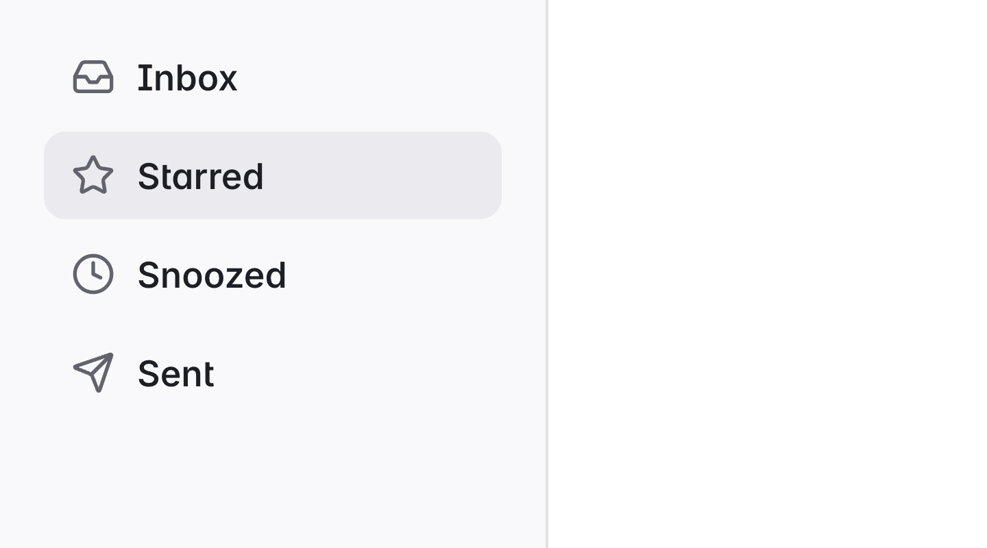
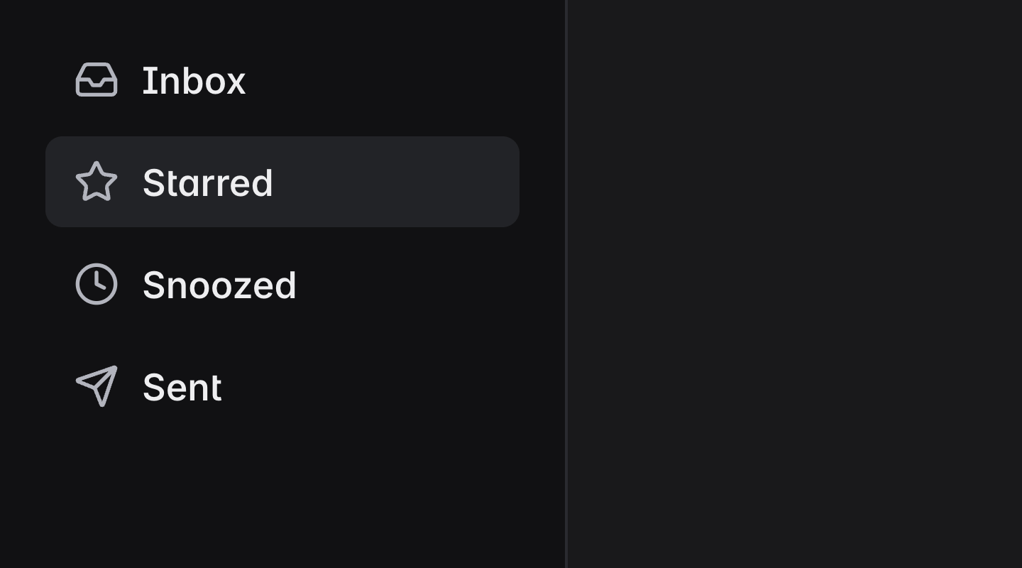
Sidenav
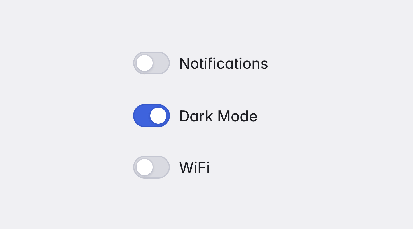
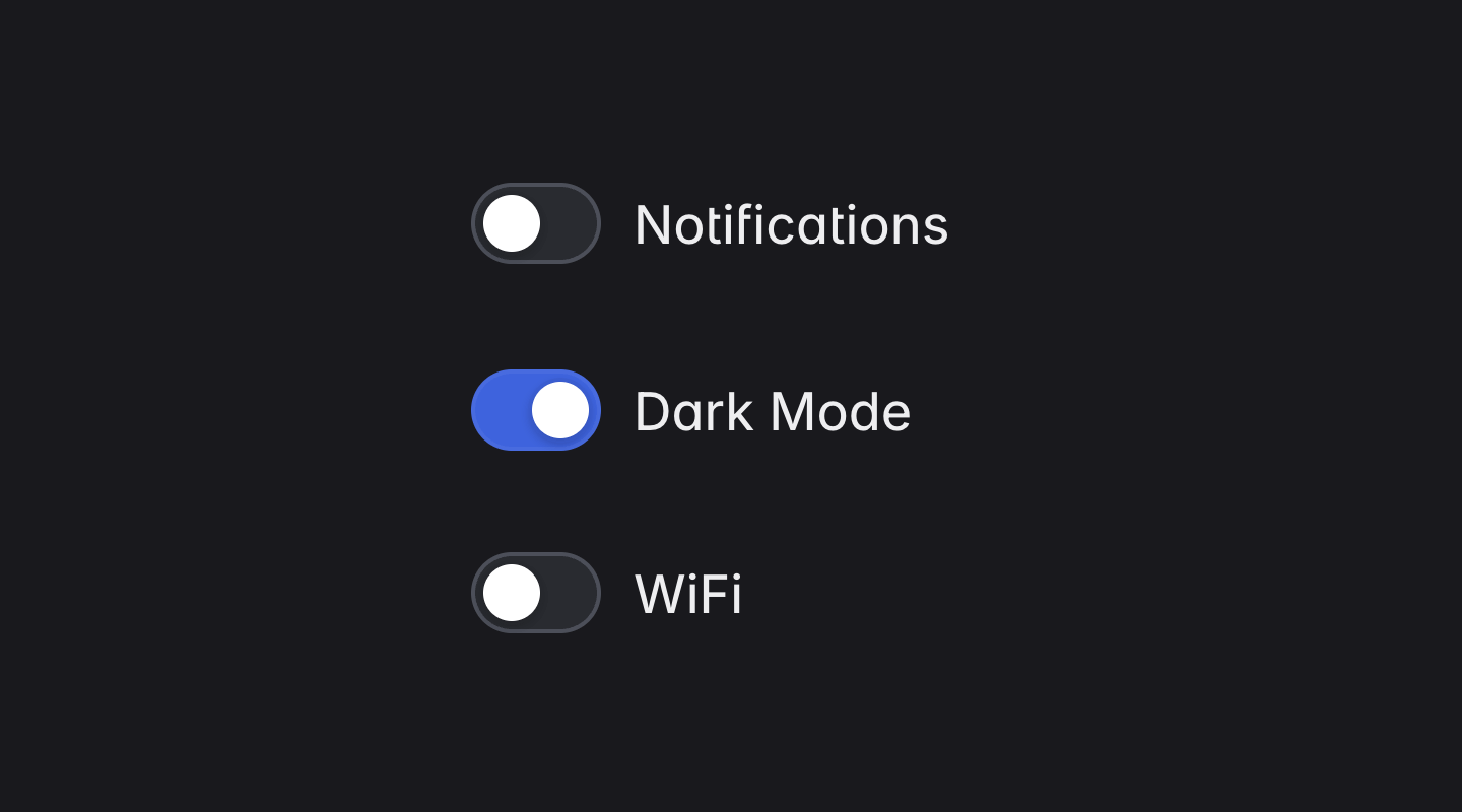
Slide Toggle
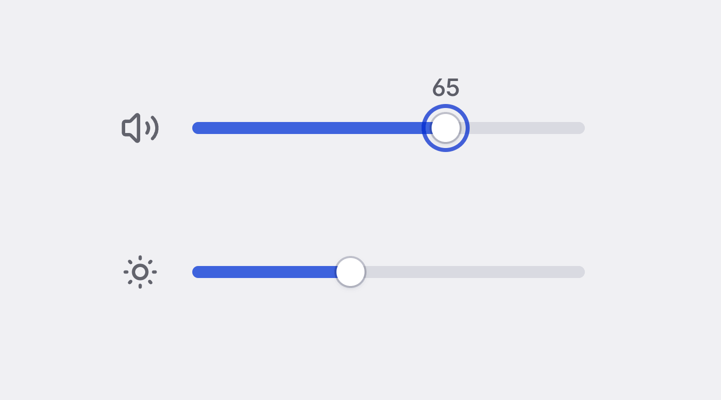
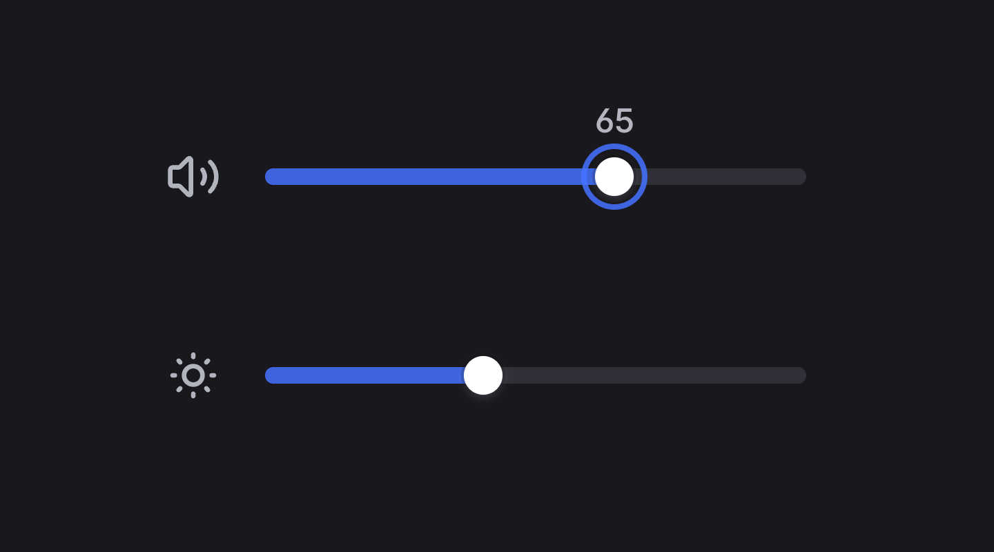
Slider
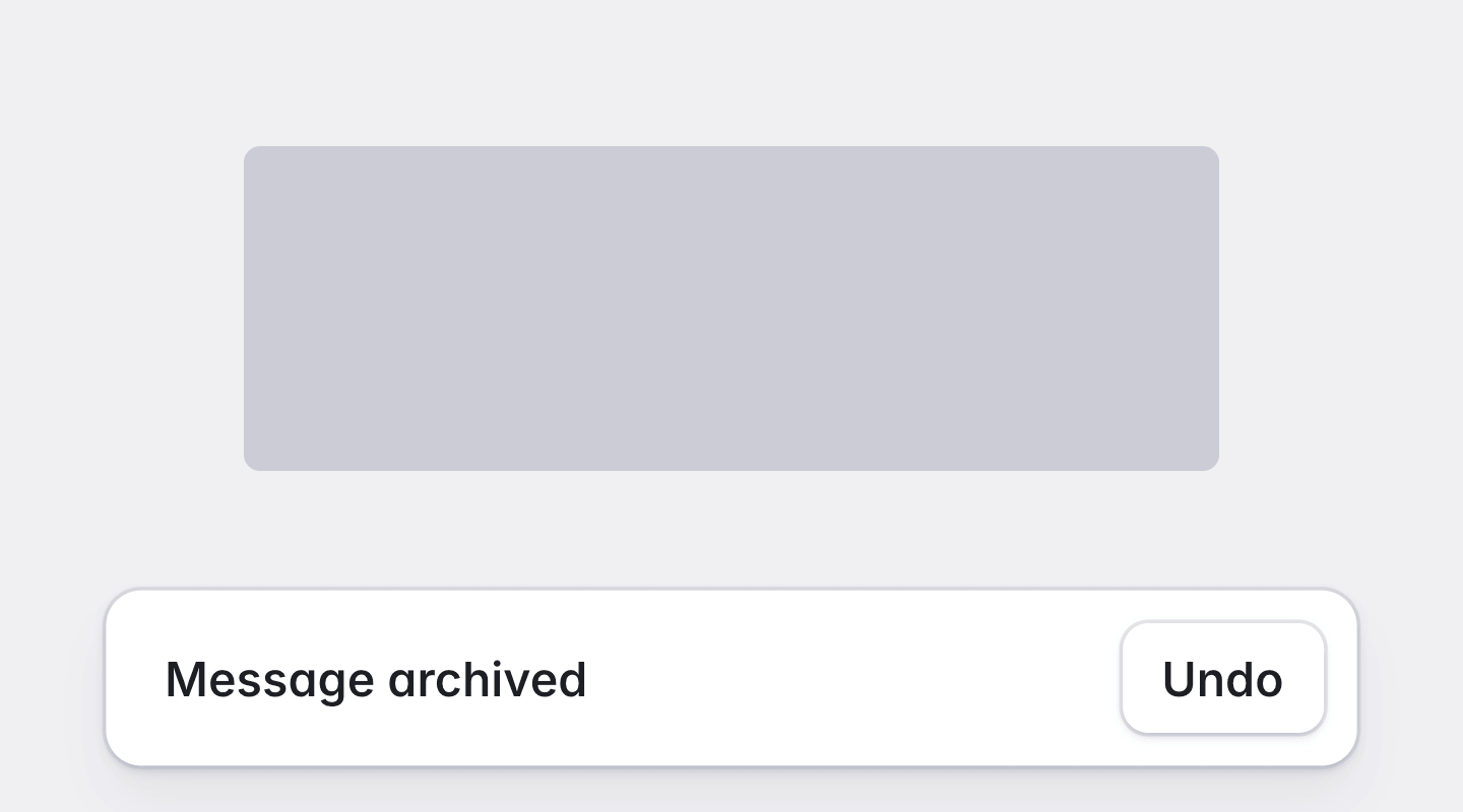
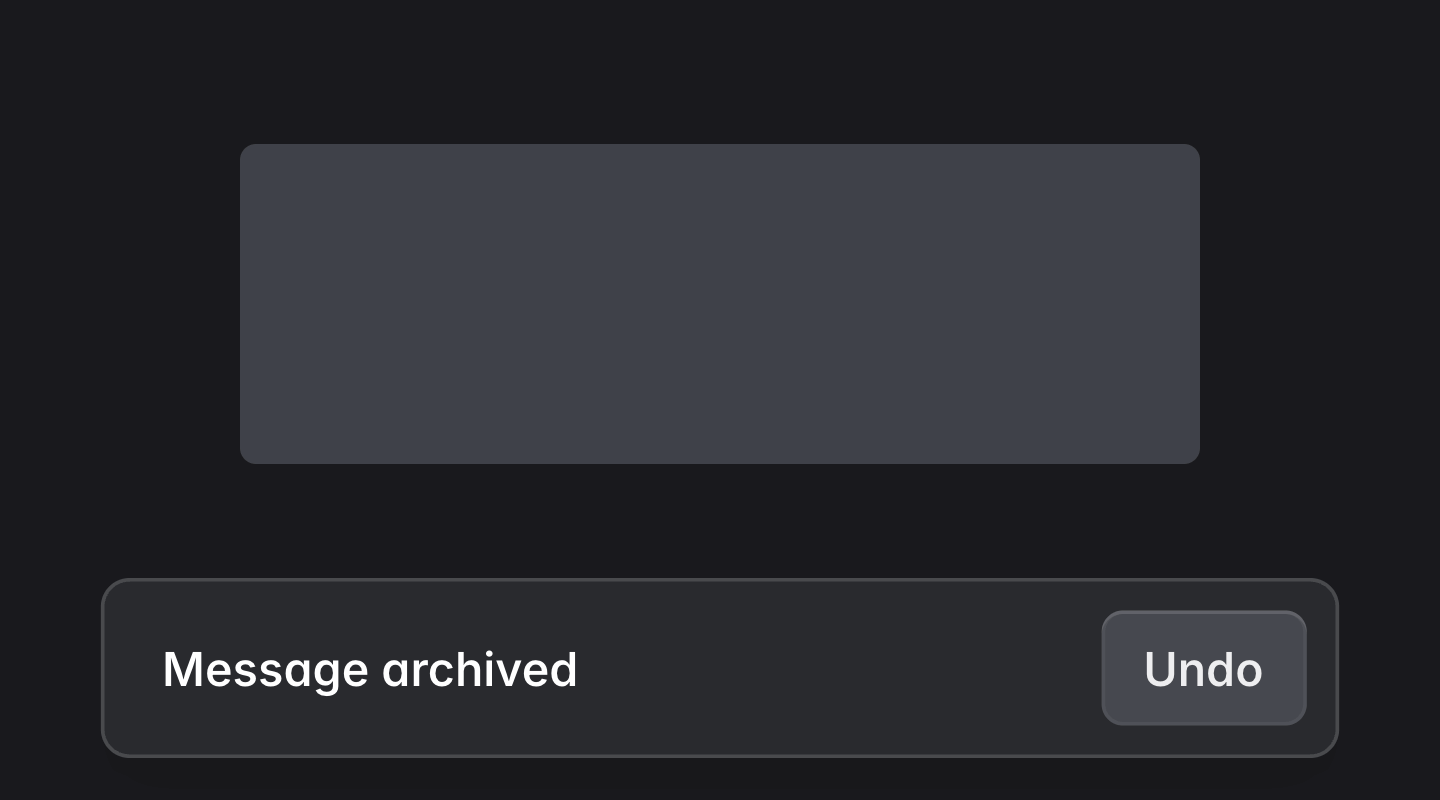
Snackbar
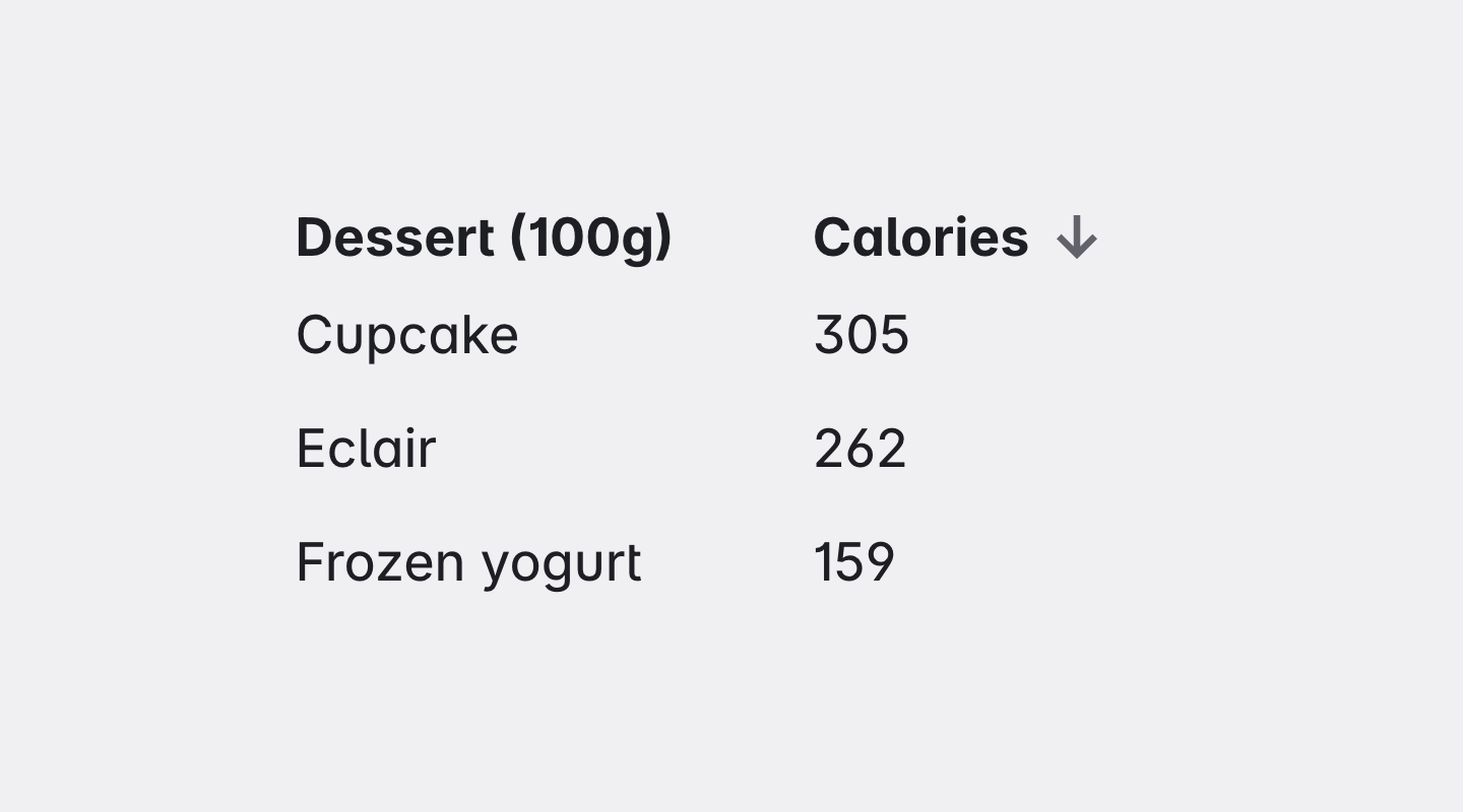
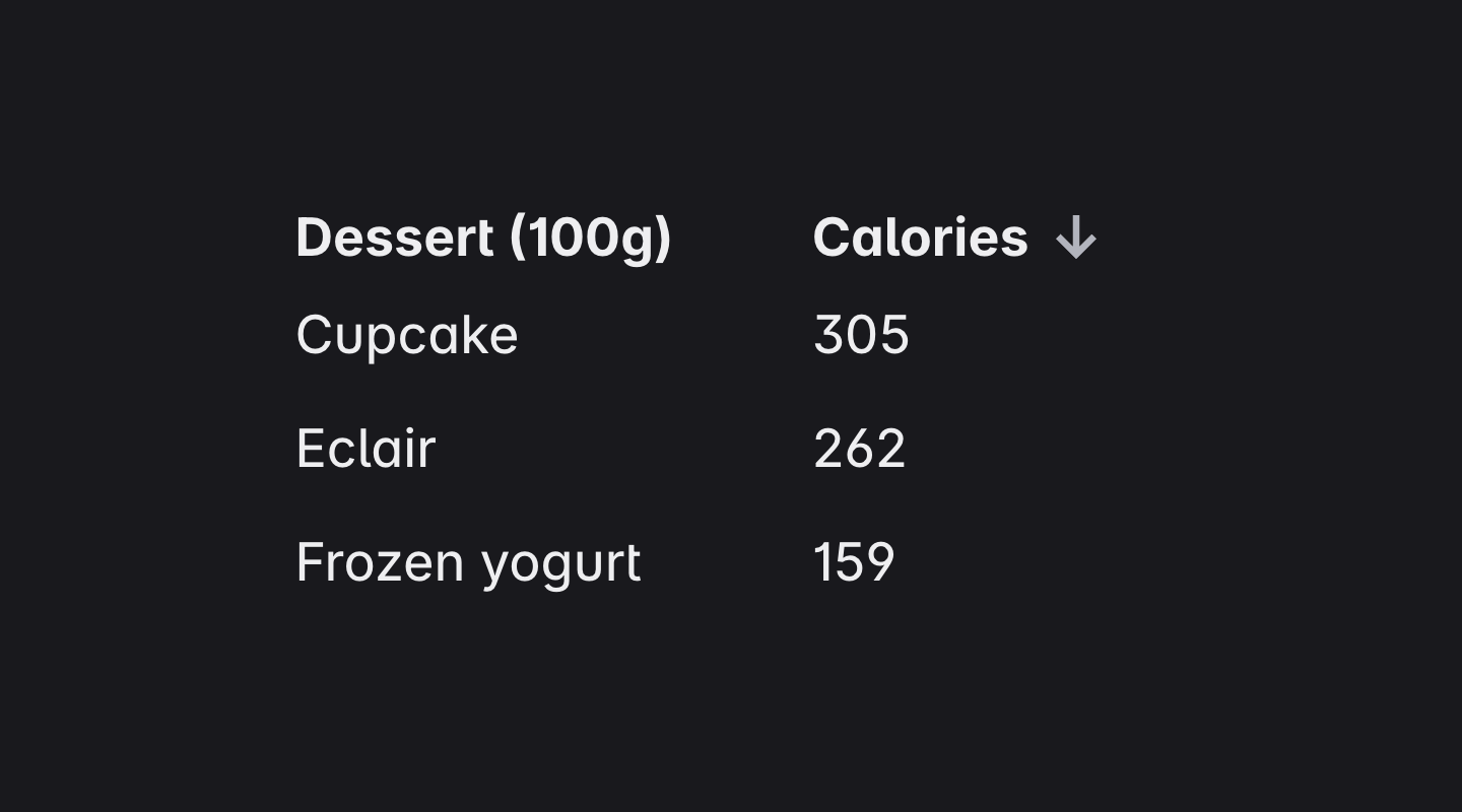
Sort Header
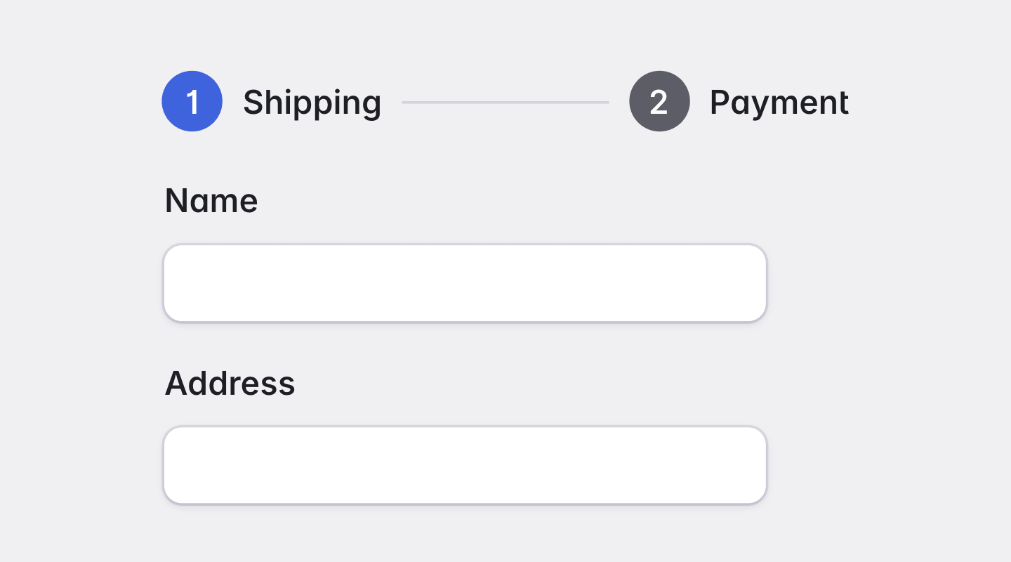
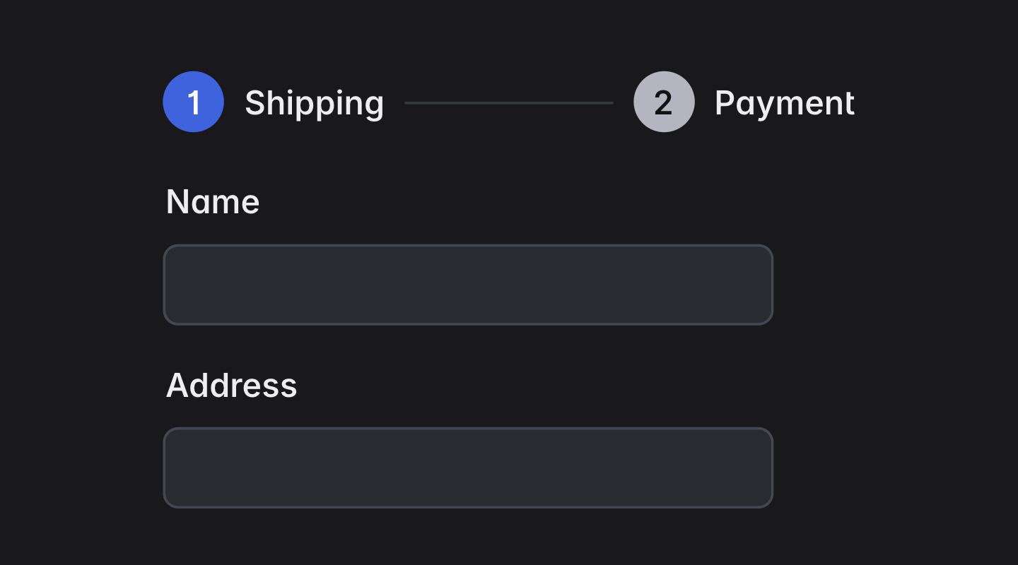
Stepper
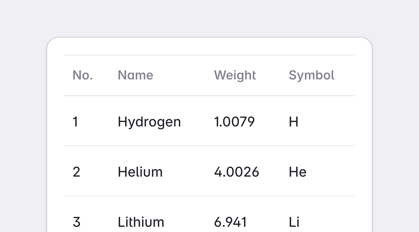
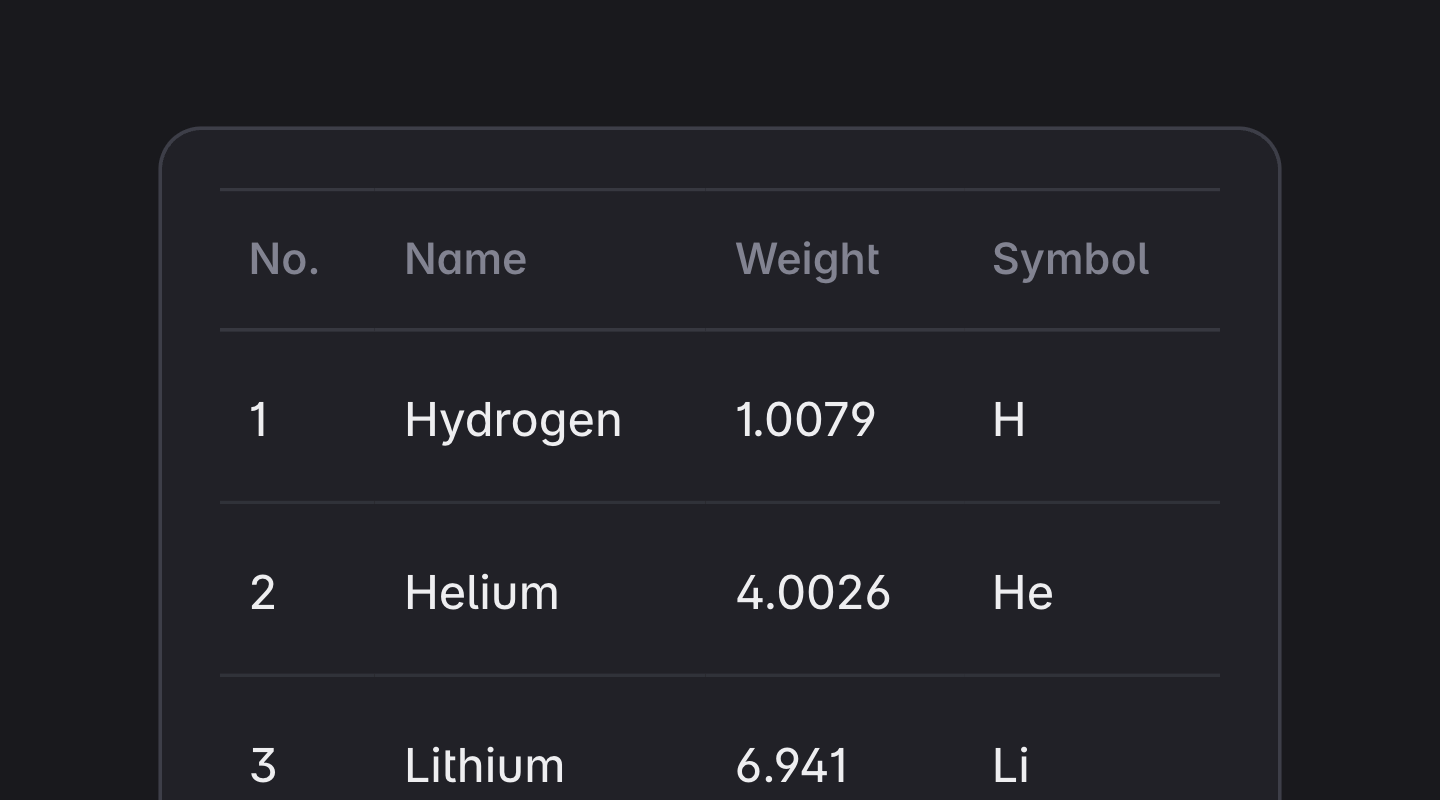
Table
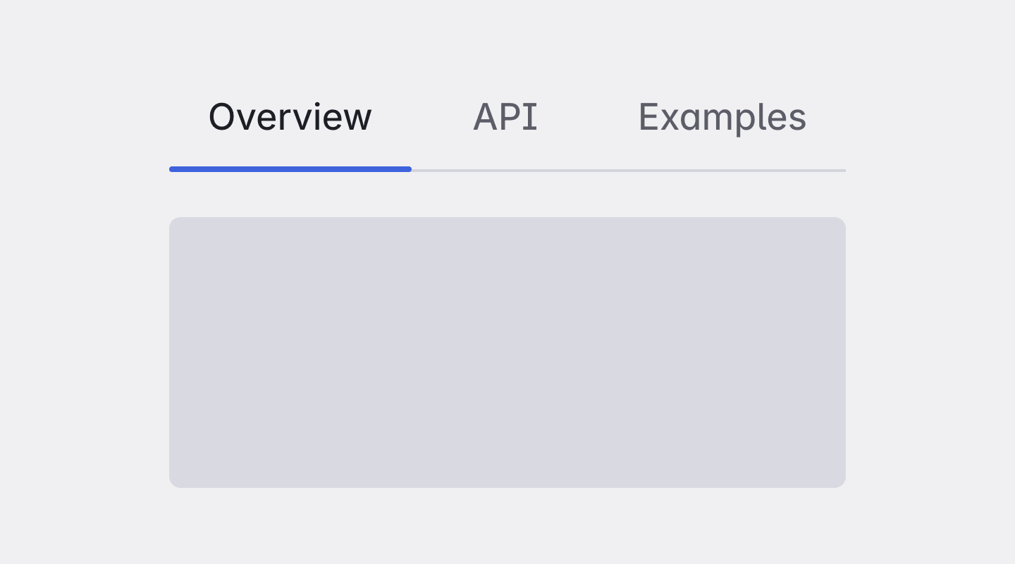
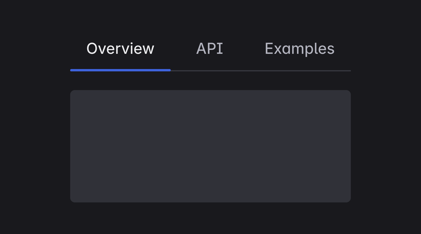
Tabs
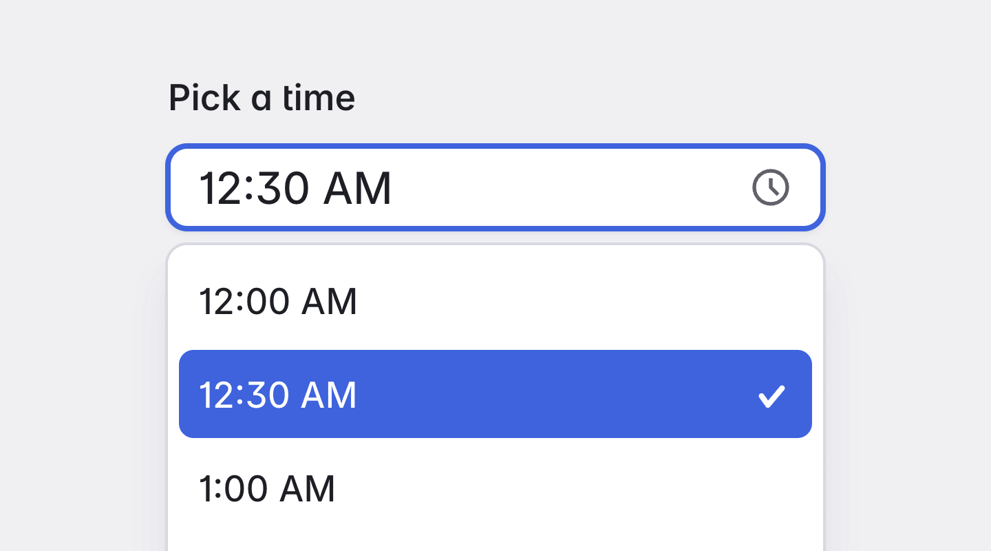
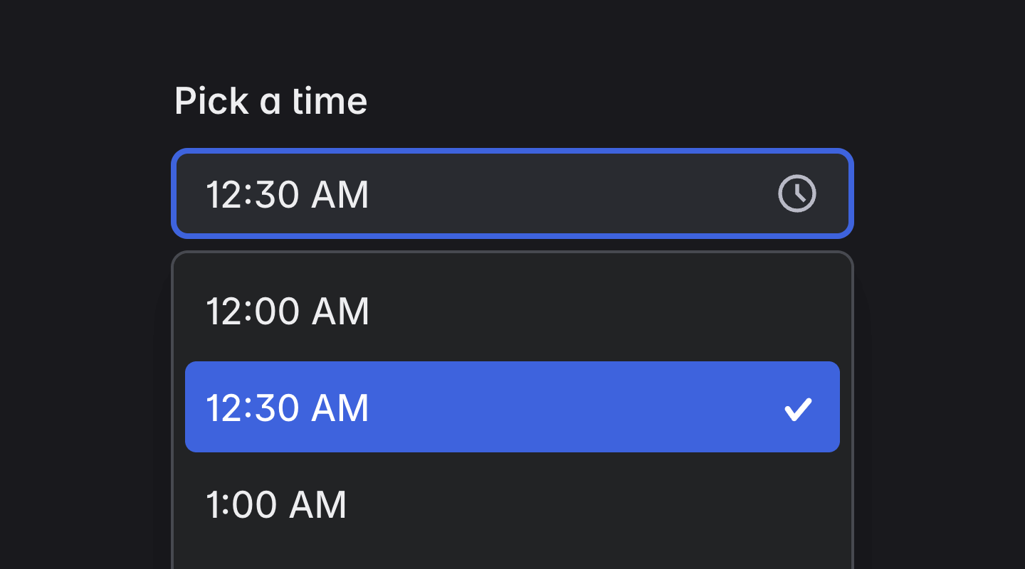
Timepicker
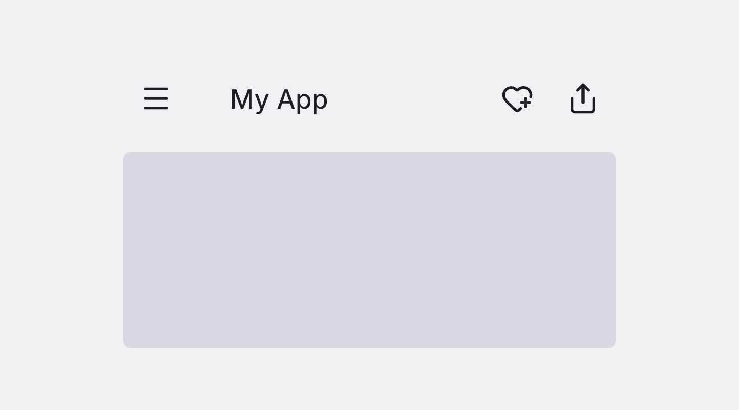
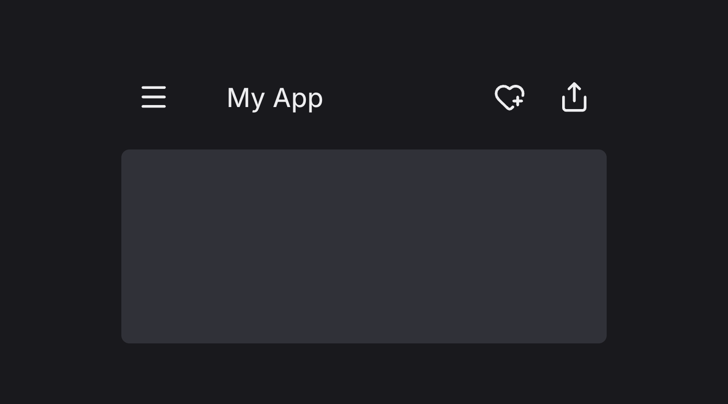
Toolbar
Tooltip
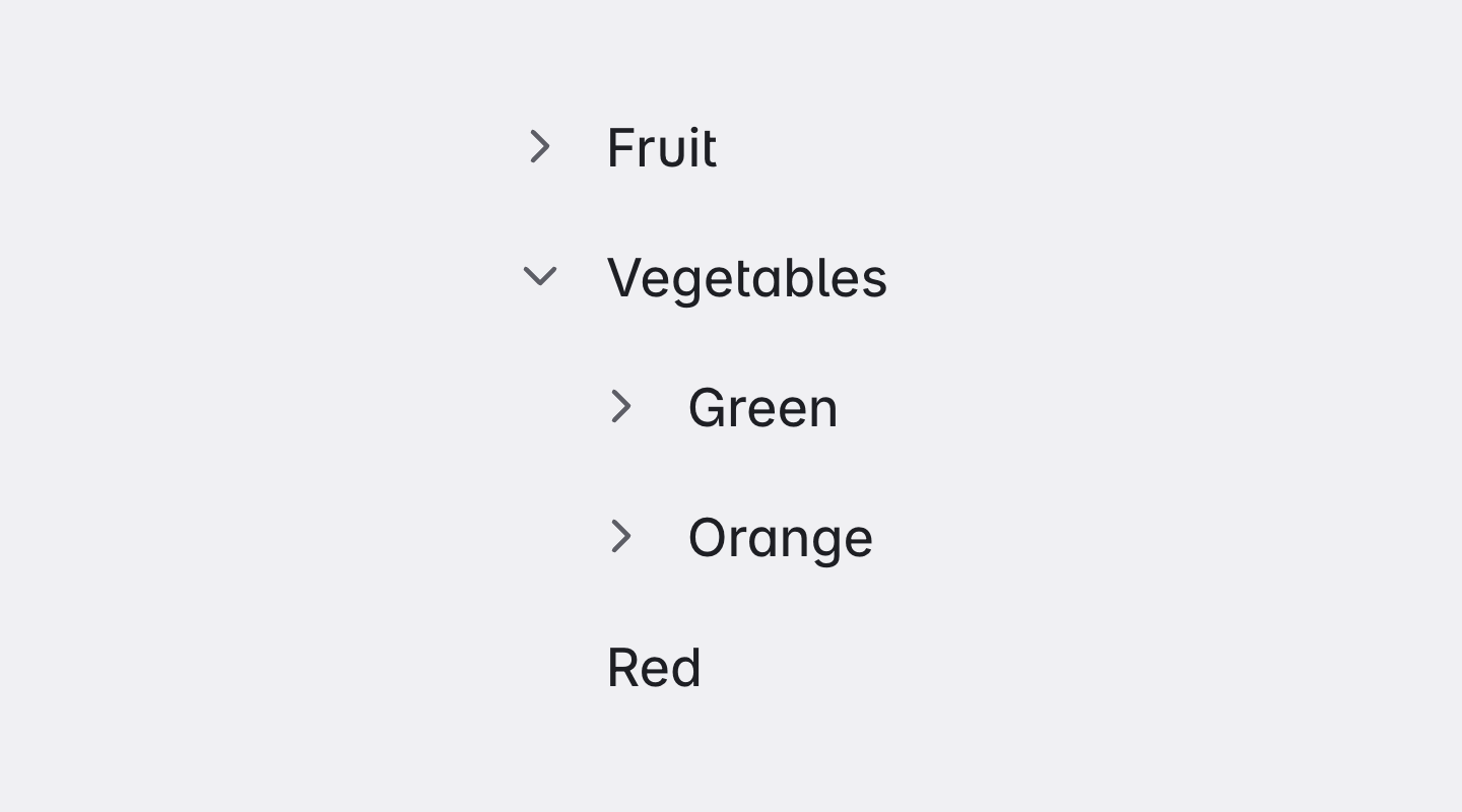
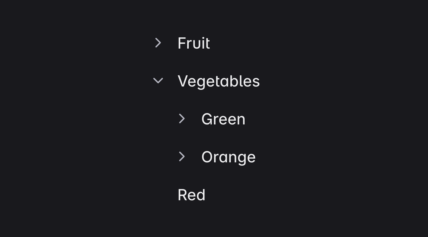
Tree
Frequently Asked Questions
Answers to the most common questions about the refined Angular Material components, what changes, and what stays the same.
Are these custom components?
No. BuilderKit doesn't include any custom primitive Angular components. Instead, it provides refined styles for the standard Angular Material components. These styles enhance the appearance of the existing components you already use, giving them a more modern and polished design without requiring any changes to the components themselves.
How does BuilderKit change the design?
Every Angular Material component is restyled with plain CSS inside one #bui scope. The styles target what Material renders and read colors, radii and spacing from CSS variables, so there is no Sass theme to configure and no fork of Angular Material. Everything ships as source in your project, so when something needs to change you edit the CSS file for that component.
Is BuilderKit a wrapper around Angular Material?
No. You import MatButton, MatTable and the rest from @angular/material exactly as before and use the same inputs, outputs and directives. BuilderKit adds the styles, not a layer in between, so there is no second API to learn and nothing to migrate when Angular Material moves on.
Is accessibility the same?
Yes. Keyboard navigation, focus management and ARIA attributes come from Angular Material, the CDK and Angular Aria, unchanged. BuilderKit only changes the visual layer and keeps focus states visible in both light and dark schemes.
What about theming?
BuilderKit comes with its own theming system that is separate from Angular Material’s built-in theming. It supports both light and dark modes out of the box, can be customized to fit your brand colors, and allows changing colors at runtime for dynamic theme switching. However, it does not integrate directly with Angular Material’s theming API, so you cannot use Material themes to change the appearance of BuilderKit components.
Advanced Components follow the same design system. Colors, spacing and typography are fully aligned with BuilderKit’s tokens, so they support the same light and dark modes and runtime theme changes.